The Curious Case of Twitter and Twply
A good example of deceitful design.
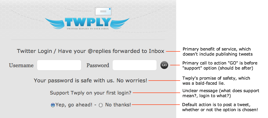
Late last week a service called Twply tricked over eight hundred Twitter users to give over their sign-up credentials using deceitful design. I’ve annotated their sign-up screen to show how they did it.
The Twply story is a lesson in many ways (see the discussion about the password anti-pattern here, here, and here), but I going to focus on the interface of the service in particular.
First off, here is how the ruse worked. Twply claimed to send @replies to your inbox, a valuable service that Twitter doesn’t currently provide (Twitter does give you the option of sending direct messages) When you signed up for Twply, you enter your Twitter username and password to give them access to your account. You also had the option to “support” Twply on your first login (an option which was on by default). Many people did this. However, after they signed up, many noticed that Twply had posted to their account on their behalf (that’s what “support” meant). The message read:
“Just started using http://twply.com/ to get my @replies via email. Neat stuff!”
So followers of the person, upon seeing the tweet, would then go see what Twply was about, and the process would repeat itself. Thus Twply started a viral campaign that spread itself to thousands of twitters very quickly. This, in itself, isn’t a bad thing. Unfortunately for people who tried Twply, they did it using deceitful design.
I’ve annotated the Twply screen with a few of the problems, including patently false copywriting, ambiguous messaging, and interface elements that are out of order.
(click for full size)
Further, Twply was creating false recommendations. When a follower would see “Neat Stuff” in the tweet, the rational assumption would be to believe that the person had actually posted the tweet themselves. Of course, they didn’t, and so the deceiving message was passed off as authentic.
Even worse, Twply sent the tweet even if you selected the option to not support them! This is evil, and must never happen in interface design. It’s akin to the database mantra that you must never show conflicting data. In this case, there must never be a conflict between the actions of the system and the interface which describes it.
But that’s not all. During Twply’s fast rise to prominence, Robert Scoble posted his thoughts on the matter, calling the ruse “SPAM”. Someone from Twply commented on the post, claiming that people didn’t have the right to complain:
Honestly everyone needs to stop yelling about the message, we clearly ask on the homepage. Before it was based on IP but we took that off so everyone can see. If you want to see please log out or see the screenshot here. http://upload3.net//uploads/761Picture%206.png
Sorry if this killed your twitter account, but dont say we didnt ask.
The service is currently down right now due how effective the marketing worked.”
Obviously, this denies the reality of the situation. The interface is not clear at all. Nowhere does it say that the service will post a tweet on your behalf. That, at the very least, needs to be made explicit. (of course, this issue is moot anyway since the tweet was sent even if you opted to not “support” Twply).
Finally, as if to declare to the world their evilness, Twply was auctioned off within 24 hours, after having accumulated over 8 hundred twitter passwords, for $1,200.
The text they used to help sell their newly minted dataset?
“Twply has been spread through twitter like nothing I have ever seen before, over 800 accounts added in one day.
Big names like TechCrunch, 1938media and many more using the service.”
Moral of the story? Design can effectively be used to deceive people. Deal only with those services you know and trust. Oh…and don’t trust everything you twead.
