Designing for the Next Step
There are two things that every designed screen must do well: describe the current step and describe the next step. It’s as simple…and hard…as that.
Note: this is an excerpt from my forthcoming book Make them Care!
In a recent post (Why you should bury the sign up button) I told the story of a redesign I did in which people just didn’t want to click the “sign up” button on the home page, no matter how beautiful or sexy that sign up button was. What I realized from that project is that there are cases in which no amount of visual design will significantly improve the state of things…instead we need to focus on making people care.
Here’s another example. On cyber Monday this past November I received an email from the New York Times informing me that I could save 50% on a Times Digital Subscription. It was time sensitive…offered today only, so I had to act fast in order to take advantage. While I don’t read many emails like this, I did read this email because I think the New York Times is one of the better news outlets out there (although now I’m not so sure) and I have an iPad that I enjoy reading on. Perhaps the Times had something interesting here, so I kept reading. Here’s the email:
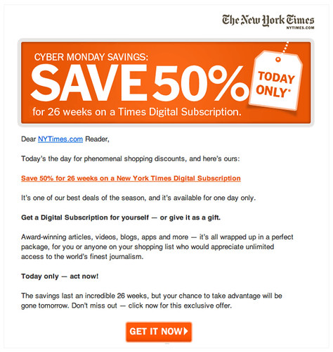
I ask you to notice several things about this:
- It’s an offer about money. The primary content of this email is about the savings one would get for taking advantage of this offer. “Save 50%” is the first text you read and the most visually heavy content on the page. Variants of the message of “saving” are repeated throughout the email. The number one message this email communicates is that I can get a very good financial deal here.
- The email assumes the value of the offer is already known. There is almost no information at all about what a digital subscription from the New York Times is. The only clue are the few words in this sentence: “Award-winning articles, videos, blogs, and more – it’s all wrapped up in a perfect package…”. That is the only description of what one would actually get with this offer.
- I have to make up my mind immediately. The only call-to-action on this page is “Get it Now”. Clearly this is designed for people who already know they want a digital subscription, or have decided to get one after reading this email. People who click that button are people who have made up their mind…who have already decided that now they want to get it.
Well, even though I’ve read the Times online for years I have no idea what a “digital subscription” is. I can already read the Times on my computer, my tablet, and my smartphone (I simply visit nytimes.com or the nice Skimmer app), so I’m already receiving the Times “digitally”. What exactly is different about a digital subscription? The only thing I know about it is that I’m not currently paying for the Times but with a subscription I would have to…but I have absolutely no idea what I would get by doing that!
A Straight-forward Fix
The design solution to this is relatively straight-forward.
The first piece of missing information is my current status as a New York Times reader. Tell me what I’m currently getting by stating it plainly. Say something like: “You currently enjoy the free Times online edition, which includes loads of free content, including top news, sports, and political news”. This could be in pretty good depth, too. Reiterate the amazing breadth of content that the Times offers for free online…and perhaps showcase one or two amazing stories of late. It’s easy to assume that readers/users/people know their current status but in many cases they will not.
The second piece of missing information is the difference between where I’m currently at and where I could be…what exactly is being offered here? Explain what is included in the digital subscription. What additional content, commentary, and news is delivered if one were to subscribe? Is there a different delivery mechanism or app I would use on my various devices? How are they better? And don’t be generic here…”videos” and “blogs” are not compelling features of a digital subscription! I’ve got those in spades, baby. Show me…dive deep into the details about how this experience is superior to the one I currently have. The design problem here is to answer the question of what makes the Times videos and blogs different and better.
Remember that comparison is how people make decisions. The email the Times sent does not allow me to make the comparison they need me to. By sending an email with merely an offer to pay money the only comparison I can make is between not spending money and spending money…think about that for a second! I think we all know which one will be chosen. Choosing to not spend money is the rational choice here. So give people something to compare! Show the comparison between these two sets of information side-by-side and let people compare what they’re getting with what they could get. Paint a beautiful future for them! Never assume that people know anything about an offer…and strive hard to clearly communicate that comparison every single time you make the offer.
The Times email problem and the sign up problem from my last piece are similar. The designer(s) are trying to compress a process that takes time into an immediate decision with little information. In both cases the conversion rate is going to be low…very low…I would bet dollars to doughnuts the Times was not overwhelmed with the success of their Cyber Monday email campaign.
Designing for the Next Step
I call these design failures a failure to “Design for the Next Step”. When designs fail to provide an appropriate next step for users it stops them in their tracks. They simply click away to another web site, stop using an app, or otherwise leave.
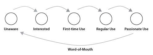
So let’s dive into this fundamental problem of interaction design. It is easiest to start by putting the problem in context. The Usage Lifecycle shows the progression someone makes as they use your software over time. From a practical standpoint most people go through stages as they learn about, try out, make the decision to use, and continue to use your software.
Here is an example of what the Usage Lifecycle looks like:
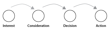
We can also dive down a level deeper and look at a stage in more detail. Here is how we might find the “Interested” stage of the Usage Lifecycle:
These steps are stable for most software. When we fail to design for the next step, we break this progression in some way. Most designs suffer from one of the following ways to blunder:
- Moving too fast through steps. When you give people too little information and ask them to continue to the next step anyway. You’re asking them to move too quickly through a process that takes time. This happens a LOT, and usually results from a lack of context given by the designer. Too little explanation, too many competing screen elements, not enough examples or supporting content, all of these things contribute.
- Skipping a step. When you completely skip an important step. This usually happens early on in design…you simply don’t make it very far if you’ve skipped a step as your usage plummets.
- Steps out of order. Asking for billing information before showing shipping rates on e-commerce sites is a common example. This tends to stop people in their tracks, as people want to know what they’re going to pay before they enter their billing information. This is exacerbated because shipping costs are often higher than expected. This is common in app design as well. Using templates is an interesting example…sometimes you choose a template before creating a thing and sometimes you want to create the thing first. I’ve seen both ways make sense, depending on the object in question.
- Showing a step too early. Timing is important, too. Take pricing, for example. Pricing is a signal, and if your pricing is relatively high it is easy to dissuade people from buying if you show them prices before you’ve convinced them of the value of your product. Another example is asking people to share your app with friends upon initial entry…while you may get some activity from happy clickers, you are asking your users to share something they are not yet familiar with. This will not only frustrate them but also stop some of them in their tracks. Better to share when appropriate, after they’ve had success with the software.
- Automating a step while taking control away from users. In general, software and hardware is an augmentation of human thinking and action, so automating tasks is usually very helpful. But in recent years we’ve seen software go way overboard. Sites that tweet for you without your permission. Apps that auto-friend you with others. The crucial aspect is control. If you do something for someone while keeping them in control you are usually good. Do something for someone and take away their control of it and you will have problems.
- Inappropriate next step. Or the next step might just be inappropriate, the wrong next step. This often happens when designers try to leverage some other action you take with what their ultimate goal is…when their priorities are not aligned with yours.
For every interaction you design, think about why it’s not working in relation to these questions. Are you moving too fast? (likely) Did you display the steps out of order? Is the next step appropriate? Etc…
Three Pieces of the Next Step Puzzle
So how do we design for the next step? Well, every design situation is different and will require a different design. But in general there are three things we have to get right. Clearly communicating the current step, the next step, and how to get from here to there.
- Clearly communicate the current step. As I explained above, the NyTimes were not fully supporting the current step I was on as a reader of the New York Times. They did not clearly communicate to me my current status, so their promise of a better status didn’t make much sense. This often feels like a recapitulation of the obvious…I’ve heard designers say “Why would I tell people something they already know?”. Fight this tendency! It’s always better to be clear about agreed-upon status than assume people know something.
- Clearly communicate the next step. The Times also failed to communicate the value of becoming a digital subscriber. This is a classic problem of not addressing real customer needs. The needs of NyTimes customers is to get better news than they’re already getting (to be better informed)…not to take advantage of an offer! So the task is to clearly communicate the future in which one is a digital subscriber and is better informed than they currently are now.
If the Times had successfully communicated both the current and the next step, they would have allowed people to compare the two against each other and make a real decision.
- Clearly communicate how to get there. The Times did this well. They clearly communicated the offer and how to take advantage of it. The call to action was clear. Unfortunately, the Times didn’t satisfy the other two requirements so the offer fell flat for anybody except those who already decided to take advantage of it.
Designing for the next step is a fundamental problem of interaction design. Almost every screen we design, be it in an app or marketing website, can be improved by really focusing on the steps and sequences of steps a user goes through. In our haste we often speed up the process too much, get steps out of order, fail to present an appropriate next step, or otherwise break the sequence. By re-assessing your app or site in light of these potential errors, you can discover the sequence and timing that your users need to successfully make it to the next step.