Communicating Value through Cause & Effect on Fanfeedr
How Fanfeedr’s intro page does well to communicate the value of the service.
A few months ago we held an event called Testcase at Betahouse in Cambridge, MA where we asked four startups to come and user test their web sites with local folks who showed up. Despite the super informal user testing method we used, we clearly saw that each startup struggled with communicating the value of their service. This is a common problem…founders have a really awesome idea but it just isn’t communicated to people clearly.

One of the startups, Fanfeedr, was in super-early alpha at the time. The primary finding from testing their site was that people didn’t immediately grok what the service was. A feed for fans wasn’t entirely clear…were the fans creating the feeds? What did the feed look like? Was it something people used on the site or off the site (like RSS)? These issues compounded to make the service unclear.
The end result was that people didn’t realize that the service was built around the idea that you declare your interests and then Fanfeedr essentially sets up a firehose of information for you around the teams you like. You come to Fanfeedr and get a personalized sports page. When talking with folks afterward, most people loved the concept and wanted a service to do this. The problem was that it wasn’t being communicated in the interface.
Well, Fanfeedr has been evolving since Testcase and now has a nice intro screen (you might even call it a splash page) for new visitors. They’ve directly addressed some of the issues we saw in testing, and now it’s much more clear how the service works.
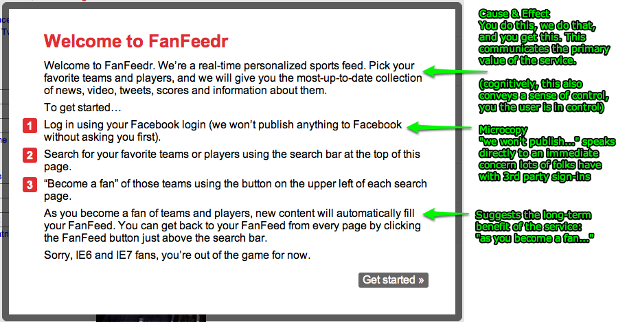
Notice that Fanfeedr is now being explicit about cause and effect. They say “Pick your favorite team and players, and we’ll give you the most up-to-date collection of news, videos, tweets, scores, and information about them”. This is it…the primary value of the service in a single sentence. If Fanfeedr is around five years from now this will still be their primary value proposition.
They’ve also got an example of microcopy in the line “we won’t publish anything to Facebook without asking you first”. This is a concern that lots of folks have with 3rd party sign-ins, and Fanfeedr is addressing it up front.
And finally they’ve included a nice list of how to get started. (I recently wrote about a variant of this technique that I call The Strikethrough Method)
While screens like this are trivial to build, they are not always easy to design. In some cases, you simply don’t know how best to explain what you’re building (this is the elephant in the room in many startups). In other cases, the value you think you’re providing isn’t the same value that people are hearing (more common than one might think). Doing quick user tests can get you over this hurdle, teaching you about what people see as the core value, and also telling you about what microcopy you might need for contingencies.
The screen is not perfect, however. For one thing, the statement of value is by far the most important content on the page. Bolding that sentence, at the least, would help. In the current design attention is drawn to the red numbered list first (red is powerful at drawing attention, as is the visually outdented list) Some people won’t even read the starting paragraph containing the value proposition…they’ll simply skip it and start at the list.
Visual design aside, Fanfeedr, in a few lines of html text, now give a much more clear picture of what the service does than they did back in April. This is the essence of design…iterate…test…iterate…test…ad infinitum
So who else communicates their value well? As part of my upcoming book Make them Care!, I’m looking for exemplars of this sort of clear communication around service value. If you’ve got a service that does this well, or know of one, let me know and I’ll consider it for the book.