In detail: Designing in context for mobile
I’m noticing an interesting practice emerging when designing for mobile: in-context messages that help you learn or give feedback about an app. Here’s an example:
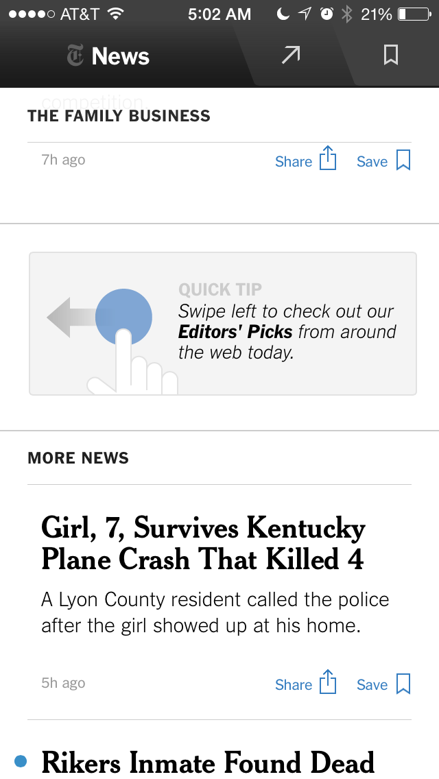
In this example from the New York Times Now app, the designers have dropped in a “quick tip” to let you know that you can swipe left to discover new content in the “Our Picks” section. Swiping in this way does the same thing that tapping on the arrow in the nav bar. This is a really nice way to let people know something, in this case that an action is available.
(That said, I think it could be argued that this action should be more easily-discoverable in the first place. It’s not clear that the arrow at top is a tab…the shading is very subtle and the arrow icon seems more like a share button. Simply labeling the tab “Our Picks” would be helpful)
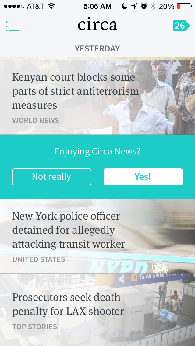
In this example from the Circa App the designers have embedded a feedback question directly in the news flow that is the main interaction in the app. This is a great way to gather feedback from people who use the app *while they’re using it*. This gets around several problems with gathering feedback, namely the problem of asking people outside of their normal use or at the wrong time.
That said, I do find myself not answering the question in many cases, however. I wonder if engagement would increase with a non-committal answer like “Meh”. I find that lately I’ve been pretty feeling Meh about the app…not a real strong feeling either way. I think it could be argued that asking for a binary answer will give cleaner feedback, but a feeling of “meh” is still very instructive…it means that the person is only have a mediocre experience. The Circa designers follow up an answer by asking for more feedback, and then make it clear that they won’t ask again, a nice touch.
There are several caveats when thinking about this type of UI element. First, this technique can be easily overdone. If you inundate users with this technique it will quickly take away from a positive experience with your product. Best to use this technique sparingly and only when you’re sure you’re adding value. (Twitter, for example, is getting close to this threshold by embedding unexpected content into your Twitterstream annoyingly) Second, this technique shouldn’t be a crutch used to overcome some UI or product deficiency…if you can solve it by designing something more clearly (which may be the case in the NYTimesNow app) then try that first.
I wrote more about gathering feedback in my most recent post on Square: In detail: Square’s email receipt and feedback flow