Interface Compare: Inviting Friends on MySpace & Facebook
I’m introducing a new type of post here at Bokardo called “Interface Compare”. I’ll use it to compare interfaces from different services to highlight interesting things designers are doing (or not doing). The first installment is comparing the Invite screens on MySpace and Facebook.
MySpace Invite Screen
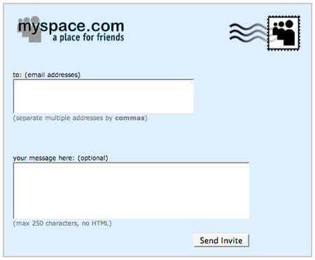
The interface for this is pretty straightforward. You can type in the email addresses of all the friends who you would like to invite, separated by a comma. You can also add a message to the invite if you want.
Facebook Invite Screen
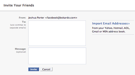
You’ll notice one big difference between the Facebook and MySpace invite screens. Facebook allows you to import addresses from various third party email systems. You can grab your contacts from webmail services such as Gmail, Yahoo Mail, and Hotmail. You can also import contacts from your desktop mail applications as well.
I’m introducing a new type of post here at Bokardo called “Interface Compare”. I’ll use it to compare interfaces from different services to highlight interesting things designers are doing (or not doing). The first installment is comparing the Invite screens on MySpace and Facebook.
MySpace Invite Screen

The interface for this is pretty straightforward. You can type in the email addresses of all the friends who you would like to invite, separated by a comma. You can also add a message to the invite if you want.
Facebook Invite Screen

You’ll notice one big difference between the Facebook and MySpace invite screens. Facebook allows you to import addresses from various third party email systems. You can grab your contacts from webmail services such as Gmail, Yahoo Mail, and Hotmail. You can also import contacts from your desktop mail applications as well.
It is probable that the Facebook invite screen causes more invitations to be sent than the MySpace invite screen. They’ve made it much easier to add large amounts of contacts without having to type in the addresses by hand. Imagine typing more than a couple email addresses in that tiny little window! Also, we have to ask: how many email addresses do we remember anyway? Even if we typed in all that we could remember, we would still have less than is what is in our contacts list. The Facebook interface makes all that hassle a non-issue.
Does Facebook’s design have an effect?
So how much of an effect would this design difference make? Obviously, the Facebook interface allows many more people to be invited more quickly, suggesting that Facebook has the potential to grow faster. Indeed, that does seem to be the case, as evidenced by recent Compete stats.:
However, there are innumerable other factors involved as well. What about the email that gets sent out for the invite? Is it compelling? Does it entice people to click? The complete process of Designing for Word of Mouth has many steps of which the invite screen is only one.
Therefore, we cannot pin Facebook’s growth on this particular invite interface. What we can say, however, is that a consistent focus on issues like these will have a positive effect over time. So while the interface probably isn’t the only reason why Facebook is growing faster, it most likely contributes to it. If many design decisions like this are made throughout a site, they can have a significant effect.
Facebook’s Progressive Disclosure
Additionally, the popup you get on Facebook when you press “Import Email Addresses” is nicely done:
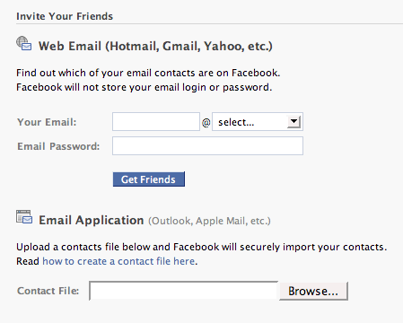
You’ll notice they’ve separated out the two activities (that were one activity in the previous screen). This is an example of progressive disclosure…only providing enough detail as needed at the moment and providing more when the context necessitates it. On the previous screen the “import email address” looked like a single activity. Now, as we progress further it’s actually split into two activities.
Facebook also adds a link for “how to create a contact file”, a nice touch for those folks unfamiliar with how that works.
These invite screens are a good example of different approaches to the same problem. One requires lots of typing…the other requires none.