Interface Design Principle: Let people learn more

by Joshua Porter  |   13 Comments

Update #2: Jon from Slideshare responds in the comments with excellent help. And in reflecting on this post…I realized it’s silly to call the design (or Slideshare) evil. This isn’t evil…it’s an interface.

Update #1: There is indeed a group on Slideshare called Presentation Design Tennis. So the following email is true…

I received an email that was supposedly from Slideshare. I don’t know if it really is from Slideshare, but it feels like a devious email either way.

Here is a screenshot:

Slideshare Invitation

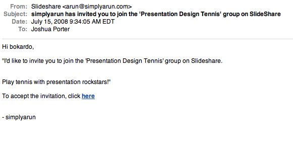
As you can see, there is a single link in the email. It is a confirmation link, meaning that if you click on it then you are confirming your acceptance of the invitation.

The problem is, I don’t know if I want to accept the invitation yet. There is no way for me to find out more about “Presentation Design Tennis”, which sounds interesting but bears no credibility at all since I’ve never heard of it. What I really want is the ability to find out more about it. If there had been a “find out more” link, I would have clicked it.

In this case, though, the design is somewhat evil careless, in that it tempts you by telling you of an invitation (social influence) but doesn’t allow you to find out anything before you accept. (Classmates.com is currently killing the respect of their users in this same way.)

This also reminds me of the subtleness of Facebook’s Beacon platform, which was designed in a similar manner…where the default action would get you involved in something that maybe you didn’t want to be involved in.

The takeaway is that this is really about respecting users. The best experience for users in this case would be to be able to find out more at their leisure, without committing to anything they don’t want to. A good solution might be “Accept Invitation” or “Learn more” links. The “Sign Up or Learn More” patterns seems to be in wide use these days, and for good reason. Yes, you might have lower numbers of people actually doing the thing (in this case joining the group), but you’ll know that the people who did end up joining really want to be there.

Comments ( 13 Responses so far )

1.  Peter R. Wood on July 15th, 2008 (Comment) #

Of course, now the truly devious will simply include a “learn more” link in their email that does the same thing the “confirm” link does.

2.  imma on July 15th, 2008 (Comment) #

Well, unless it’s from someone you know, it looks like spam to me as it seems to be a mass mailing with a generic message ;)
Personally i’d marke it as spam & block the application that sent it :)
- imma

3.  Marty Alchin on July 15th, 2008 (Comment) #

Another interesting note about the devious nature of that email is that the sender isn’t even accurate. It lists “Slideshare” as the name, but it looks like it’s coupled with the email of the person who invited you. That person’s name is almost certainly not “Slideshare” nor is that email connected with Slideshare in any way.

That’s especially important in context, because a simple (though ideally unnecessary) step would be to just pluck the domain out the sender’s email and stick it into a browser to see what the site’s all about. Without that, and by sending an HTML email instead of plain text, it only leaves you with two options:

* Fire up your favorite search engine and plop in “Slideshare” since you don’t know if it’s .com, .net, .org, .biz, .tv, .fm, etc. It could even be a MySpace page for all you know. This is ends up getting a third-party involved (the search engine), probably with advertising revenue at stake. So not only are you as a user getting confused and mislead, but you’re may also be giving the site some cash for the experience.

* view the source of the email to get the domain out of the link. Many HTML email users don’t even realize they’re using HTML email, much less have a clue how to view the source, so this should never be an acceptable expectation.

I’d also offer a third option to your “Join Now” and “Learn More”: “View this person’s profile”. Sometimes, I don’t even know the person who’s inviting me to join a site, so I have no reason to trust where they’re sending me. With twitter, for instance, I can look at someone’s bio to see if they’re into web development, Python or Django to determine whether it’s a legitimate contact or just spam.

This is especially sad, because I’m a Slideshare member and it’s actually a pretty good service. I joined from word of mouth, where I got a good explanation of what it’s about, so I’ve never seen this email. Such a shame.

4.  Marty Alchin on July 15th, 2008 (Comment) #

Also, I’d like to add that you need to know what information is important to learn about. I was curious to see some of these carbon footprint apps people have been talking about lately, so I signed up over at thecarbonaccount.com and a few others. Well, as I filled out my profile, I quickly realized that it’s designed solely for users in the UK. From where you live to what electrical provider you use, even what car models you have to choose from, all are based on the assumption that you live in the UK.

Unfortunately, there’s nothing on the site that indicates this before, or during, the sign up process. If it had been thecarbonaccount.co.uk, I could understand it, but it was a .com, which means it could be anywhere, and I expected it to cater to everyone. Boy, was I wrong. Now I have a partially-filled account at a site I can’t possibly use. They offer no option to delete the account (another fault I believe you’ve touched on before), and they haven’t responded to my repeated requests to remove my account and to add the appropriate information.

Also, before anyone tells me that the use of “tonnes” on the front should’ve been a clue, I’ve seen that spelling in a variety of things in the carbon footprint world, both within and outside the UK. Plus, even if that had been enough to indicate the origin of the site, that’s still not an indication that they *only* cater to users in that area.

I think the overall lesson here is that full disclosure is best all around.

5.  Jonathan Boutelle on July 15th, 2008 (Comment) #

So we’re not trying to be evil with that link. We’re just trying to reduce the number of clicks that a user has to perform in order to perform a given action (GOMS analysis 101). Thought experiment: is it devious if there’s an “unsubscribe” link that works with a single click?

It DOES look like we need to add a hyperlink to the group title, so that the group name (i.e. “Presentation Design Tennis”) takes you to the group and you can check it out. That’s a quick change, we can do that by next week.

The issue of the “from” setting in the email is a little bit more complicated (since email spoofing is NOT ok, and that’s what it would be if we sent an email on behalf of a user and made it look like it came from their email address provider, when in fact we sent it at their behest). I’ll look into this one.

6.  Aliza on July 15th, 2008 (Comment) #

I appreciate the post from a number of angles, including finding out that that was a real email. I got that same email, assumed it was spam, and sent it straight to my junk mail folder. I had a similar experience in that I was mildly intrigued by the idea of Presentation Design Tennis. But the nonsense sender name, simplyarun, seemed to confirm my spam suspicion. And these days, accepting an invitation in an email often results in getting sent straight to a form where one is supposed to register/fill out a profile/etc. without any real information or notion of what’s involved. With a real sender name though, I definitely would have clicked on a Learn More link because the idea sounded kind of fun.

7.  Josh on July 16th, 2008 (Comment) #

@Jonathan: Thanks for stopping by. I’m sorry that I used the word evil. It’s not right on two levels: 1) it’s just an interface and 2) I know you and Rashmi and know you’re not evil. I just didn’t think before I posted.

Making the group name a link would be great. As far as the deviousness of the subscribe link…it wasn’t the link that I was frustrated with, it was the fact that it was the *only* link. Since I did want to learn more, and I wasn’t able to without committing to something that I didn’t want to commit to, I was frustrated. My motivation was halted.

So I think it’s great that the subscribe link works as a single click…and an unsubscribe would be great too. My concern was that the only choice was commitment.

Anyway, please accept my apology for calling the interface evil. I was talking about the interface, not you, but by extension it came off bad. It was silly of me. In hindsight, this post was really a bubbling over of many different interactions I’ve had with many services…frustration borne out of using Classmates, Facebook, and other services which are are long-time pains for me. I focused my frustration on Slideshare when I shouldn’t have directed it elsewhere.

Pingback: Can Interfaces be Evil? - Bokardo

8.  Suzi on July 16th, 2008 (Comment) #

People are the best source of knowledge

9.  Matt Balara on July 16th, 2008 (Comment) #

“Evil” is certainly a bit strong. Like error pages, emails like this typically land on the “now what have we forgotten?” list and get done abdly at the last minute.

My suggestion for Jonathan is add three things to the mail:

1. In the first line, replace “I’d like to” with “simplyarun would like to” with the name as a link.

2. As others have said, make the group name a link.

3. Leave the rest as is.

Two tiny changes, and that mail goes from fail to win! If only all interface problems were this easy to solve.

10.  Niels on July 17th, 2008 (Comment) #

It is just very rude to place a link like that without informing the user or giving him an option to confirm or not to confirm. I call this ‘design for politeness’. (See link)

Pingback: SlideShare Blog » Blog Archive » Some good does come from “evil”

11.  David Bennett on August 8th, 2008 (Comment) #

It reminds me the difference between a shopkeeper shouting ‘come and look’ and a scam artist offering a freebie and then making the taker look bad for not feeling obligated for having accepted.

With the ‘tell a friend’ idea that Amazon and others have, someone comes across a site or a product or feature on a site, and uses the ‘tell a friend’ utility on the site to tell-a-friend.
The friend clicks the link and they see what is on offer. They are not committed and their email presence should not be recorded.

That is the only proper way to proceed.

Add Your Comment

Accepted tags: <a href="" title=""> <abbr title=""> <acronym title=""> <b> <blockquote cite=""> <cite> <code> <del datetime=""> <em> <i> <q cite=""> <strike> <strong> .

Preview...

If your comment contains links, or if it is your destiny, your comment may not show up immediately. I'll approve it as soon as I can. (I delete dozens of comment spams per day)

Get updated when someone posts a comment: Comment Feed


ABOUT

Bokardo is the blog of Joshua Porter, a web designer/developer, researcher, and writer. I live in Newburyport, MA, USA.

WHAT IS SOCIAL DESIGN?

Social design is design that focuses on the social lives of users. It deals with the activities, behaviors, and motivations of people who work and play together through software interfaces. It is built on the observation that many of the decisions we make are greatly affected by those we surround ourselves with in our social lives: our family, friends, and colleagues. Exploring our motivations and how to design interfaces to support them is what the Bokardo blog is all about.

Designing for the Social Web

Building a social web site or application? I wrote a book just for you!

designing for the social web

Find out more or order from Peachpit or Amazon

Upcoming Speaking Events