On Increasingly Sophisticated Social Interfaces
In many circles you hear the call of software designers saying “Less is more”. In theory this is a good rallying call, getting designers to really think about each and every feature they add. But in practice it isn’t necessarily true that taking features out of a product, or not adding features to a product, makes it any better. Sometimes, more is more.
This is especially true in social interfaces that model complex social interactions. In some cases there is just no way around it: human relationships are complex and so whatever view we offer into them must have some complexity as well. That doesn’t mean they should be hard-to-use, it just means that they communicate sophisticated information.
Take the reviews on Amazon.com. For years Amazon’s interface showed the average review, so viewers could tell the general mood surrounding a book. If it was a 5 star or a 1 star book, then that would be instantly recognizable.
But over time it became clear that the rating system had a fault: if the average rating was somewhere in the middle, say 3.5 stars, it was unclear whether it was just a dull book that most people rated as mediocre or if it was a polarizing book that half the people rated 5 and half the people rated 1. A political book, for example, usually polarizes.
So the review interface could be made more sophisticated, showing more information about how the reviews for a particular book were distributed. Amazon came up with a nice interface for this…
In many circles you hear the call of software designers saying “Less is more”. In theory this is a good rallying call, getting designers to really think about each and every feature they add. But in practice it isn’t necessarily true that taking features out of a product, or not adding features to a product, makes it any better. Sometimes, more is more.
This is especially true in social interfaces that model complex social interactions. In some cases there is just no way around it: human relationships are complex and so whatever view we offer into them must have some complexity as well. That doesn’t mean they should be hard-to-use, it just means that they communicate sophisticated information.
Take the reviews on Amazon.com. For years Amazon’s interface showed the average review, so viewers could tell the general mood surrounding a book. If it was a 5 star or a 1 star book, then that would be instantly recognizable.
But over time it became clear that the rating system had a fault: if the average rating was somewhere in the middle, say 3.5 stars, it was unclear whether it was just a dull book that most people rated as mediocre or if it was a polarizing book that half the people rated 5 and half the people rated 1. A political book, for example, usually polarizes.
So the review interface could be made more sophisticated, showing more information about how the reviews for a particular book were distributed. Amazon came up with a nice interface for this:
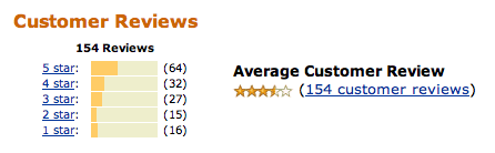
I’ve talked to many folks who have made positive comments about this interface. They like seeing more information, and it doesn’t confuse them. Instead, they get a more accurate picture of the reviews than they had before, and that helps them make a more informed decision. More is more, in this case.