Tripit’s innovative design evolves (but is it for the worse?)
One of my favorite examples of sign-up is from Tripit.com. They have a unique way of signing you up for the service. Instead of filling out a form to sign up, which is the norm, you simply forward them a confirmation email from a travel service. So you book your flight on Orbitz, they send you confirmation, and you forward it to tripit.
That’s all it takes for Tripit to create you an account. After all, they have all they need: your email. But they also have started you using the service. From the email you sent they’ve already created a travel page for you, without you having to do anything. This is a really great way to do sign up because it takes most of the pain out of the equation and gets you started instantly.
I’ve been using Tripit in talks for a while now. In a talk I gave a while back at a New Hampshire UPA meeting, I showed a screenshot of Tripit and described how they use levels of description effectively on their site. Here is the screenshot:
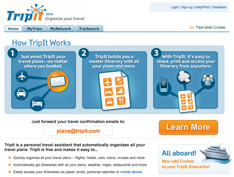
Levels of description is where they give you some information, in this case the How it Works graphic, and ask you to sign up. If you still want more information, they give you another level of description, and ask you to sign up again. If you still want more…the process is repeated until you either sign up or leave the site.
This is usually represented with a “Sign up or Learn More” sequence of buttons. This explicitly gives people a choice: either sign up now or continue to learn about our offering. Sign up/Learn More is the new Ok/Cancel.
One of the people watching my presentation, Jeff Leombruno, pointed out that although the forward an email technique was cool, it might be confusing to someone who expected to sign up like they do on other sites. His first thought was…can I send them an email without signing up? In other words, his expectations have been set by all the other web applications out there…he expects to have to sign up for the service before he can use it.
The answer is that yes, you can send an email without signing up, but that is not made explicit in the interface. The only text is “just forward your travel confirmation emails to plans@tripit.com”. While the words “just forward” imply that that’s all you need to do, it’s not entirely clear.
So Jeff and I figured that simply improving that text a bit would be helpful. Instead of Tripit’s current copy we might say “No need to sign up, simply forward your emails to plans@tripit.com and we’ll get you started immediately” or something similar. This would make it absolutely clear that the sign up process isn’t required to get started with the service.
Since I took the above screenshot, which was at least 3 months ago (when I first started putting together screenshots for the talk) Tripit has made a change to the homepage. I didn’t realize it until I went back to the site the morning after the talk to follow up on our discussion. Instead of the “Learn More” button being what gets your attention, Tripit has changed it to the very explicit “Sign Up”. Here is what it looks like:
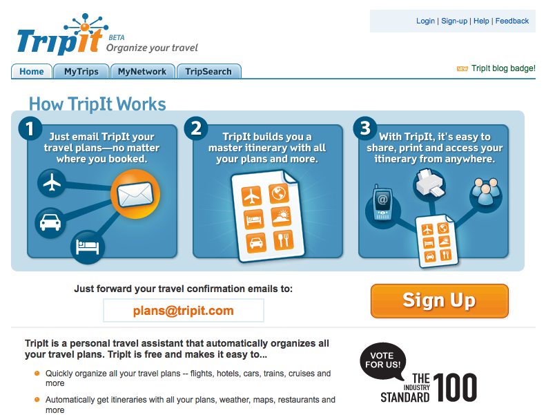
Obviously this is a stronger call to action. It is entirely clear that Tripit wants you to sign up. However, when you click on that sign up button, you’re presented with this form:
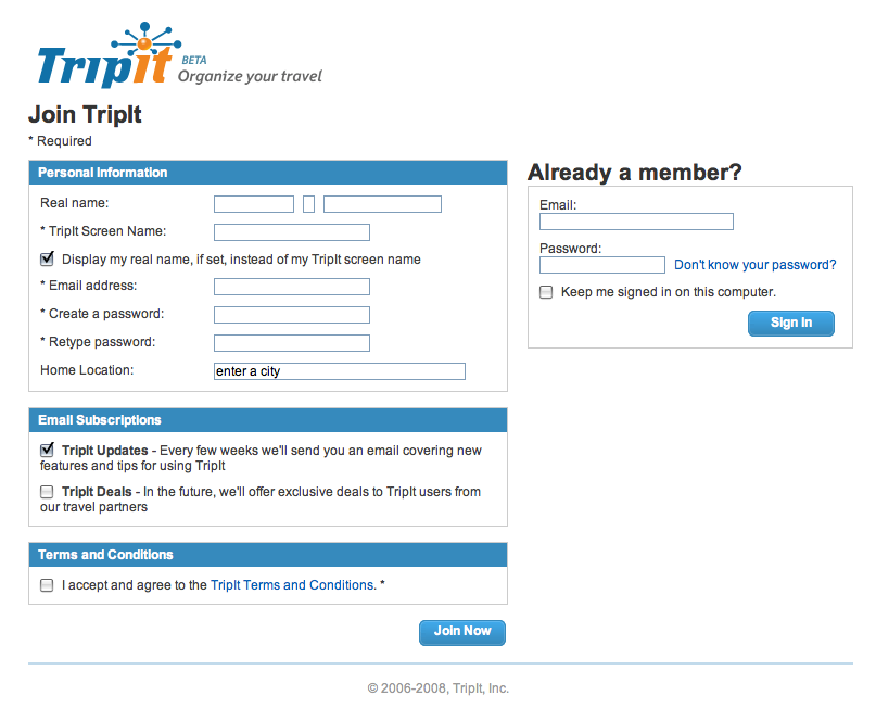
This form surely doesn’t have the smoothness of the email option. It directs ones attention to a form instead of a clever way to sign up. If you weren’t sure about the email option before (as Jeff wasn’t), then you surely would be led to believe that you must sign up for the service given that the call to action is so strong. It’s darn near impossible to ignore that huge orange button.
But I wonder: does accentuating the sign up option diminish a great selling/talking point of the service? I say this because several people have mentioned the cool email option feature to me as they tell me about their use of the service. In other words, in explaining how the service works the ease of starting off automatically comes up…as they are one in the same. To use the service you just start using is…it’s brilliant in its simplicity.
So here’s the question: is Tripit hurting themselves (in some small way) by placing more weight on the sign-up call to action instead of the email option? Or is the stronger sign-up call to action more appropriate?
Oh by the way, I’ll be showing many more examples of good and bad sign-ups in a virtual seminar on Designing for Sign-up next week with the fine folks from UIE.
Previous
What if Gall’s Law were true?


Links to this Post
Comments
1. Marla Erwin 11:10am, Tue 2nd, 2008
I think it’s a good step toward building confidence in potential customers. The signup form is dull, but it is familiar. Web conventions are like traditions: they comfort and reassure us.
Even as a web-savvy user I’d be skeptical about the alternate method: does this really create an account, or just a one-time transaction? what if there is another person with my same name? how do I set my password? what information will TripIt use?
This reminds me of Apple’s unconventional checkout at their retail stores: no counter, no cash register, just an employee with a gizmo around his neck. It’s very cool once you’re used to it, but a tiny bit unnerving the first time. The difference of course is that, standing there with your purchase in hand and a real person to talk to, you’re less likely to bail than when faced with the uncertainty of sending your travel itinerary to a web service you’re trying for the first time.
2. Tim Jahn 11:47am, Tue 2nd, 2008
I’ve often talked about how cool TripIt was in the fact that you simply forward them your travel emails and they do the rest.
I think the extra step of actually having to fill out yet ANOTHER sign up form on a site is a hinderance. They’re taking a step back in my opinion.
Still a cool service though.
3. Louis Simoneau 12:01pm, Tue 2nd, 2008
I definitely think that the idea of “just forward the email to …” as a signup is a great idea, and a great way of grabbing potential customers who might otherwise be overcome with form-weariness.
I think that in the previous iteration, the “Learn More” button might have been overshadowing the other call to action, and this might explain why Tripit wanted to change it. But I think that the current version is too much of a return to a “ho-hum” web application signup.
Your suggestion of improved copy on the main page, perhaps combined with a less prominent “Learn More” button, would be an ideal solution (maybe large text that reads, as you suggested: “No need to sign up, simply forward your emails to plans@tripit.com and we’ll get you started immediately”, with a regular link in a smaller size underneath saying “learn more”.)
4. Robert Hoekman, Jr. 12:38pm, Tue 2nd, 2008
By replacing the “Learn More” option and removing the accompanying feature/benefit pages, TripIt is now pushing two different sign-up models, and have stripped out information that is essential for a user’s decision-making process.
The proof will be in TripIt’s conversion rate, but I believe this change will have a negative impact, particularly because the registration form is more cumbersome than it needs to be. (If all they really need to register you is your email address, why would they suddenly require all the additional information?)
5. zephyr 1:26pm, Tue 2nd, 2008
Perhaps it’s a matter of meeting different user needs, different contexts. If I’m excited about TripIt but don’t have a trip to email right at this moment I can still get started with them.
But I agree that it may not be worth it, as the prominent Sign Up button definitely interferes with and weakens the other call to action (“just send us an email”).
6. Will Aldrich 7:00pm, Wed 3rd, 2008
Hi Joshua,
I’m TripIt’s VP of Product and I wanted to shed a little light on what we’re doing.
The changes you see on TripIt’s home page are some of the first of many experiments we’re running to try to make the process of onboarding new users as smooth as possible. Our team thinks of each page as a series of hypotheses that needs to be proved or disproved. We are big believers in scientific product development, and you can be sure that we’re going to be running more experiments on our sign up flow.
As to your question, has the change from Learn More to Sign Up been for the worse or the better? We’re shy about sharing data on this publicly, but so far the evidence suggests that the change from Learn More to Sign Up has been a good change, especially taking into account other important changes we’re testing downstream from the call to action. That said, I expect this page to continue to evolve in the coming weeks and months. It may be evolving as I type!
Thank you for your thoughtful and thought-provoking writing. Our whole team enjoyed Designing for the Social Web, and we appreciate the comments that you’ve made about TripIt’s sign up process, as well as those you’ve passed on from folks you’ve met at your talks.
Best regards,
Will Aldrich
7. Josh 5:26am, Thu 4th, 2008
@Will Thanks for stopping by and giving us some insight into your process…are you able to share what some of your testing methods are you use to make sure the change has been for the better?
Also, do you think that the change to a more direct call to action is making the page stronger? While I wrote this piece as a discussion-starter, based on a conversation I had, I would love to follow it up with real data and see how it really panned out. Cheers!
8. Rahul 1:47pm, Thu 4th, 2008
I clicked on through from the RSS feed wondering whether someone from TripIt would stop by and comment and was rewarded for the effort! Thanks for the post Joshua and feedback Will, it’s always interesting to see a dialogue open up like this.