Yahoo’s one page experience
I really like the direction they are going, and once they get rid of the flyouts and refine the me-first dashboard experience of the homepage, I think it could be really valuable. But the moment you step off their brand new stage, your clean, vacuum-packed experience gets replaced with some other experience, the one on the other sites.
Yahoo recently redesigned their home page, the most visited page on the Web. The redesign came along with lots of media coverage: Yahoo (and the media who covers them) seems to place a higher weight on redesigns than most other organizations.
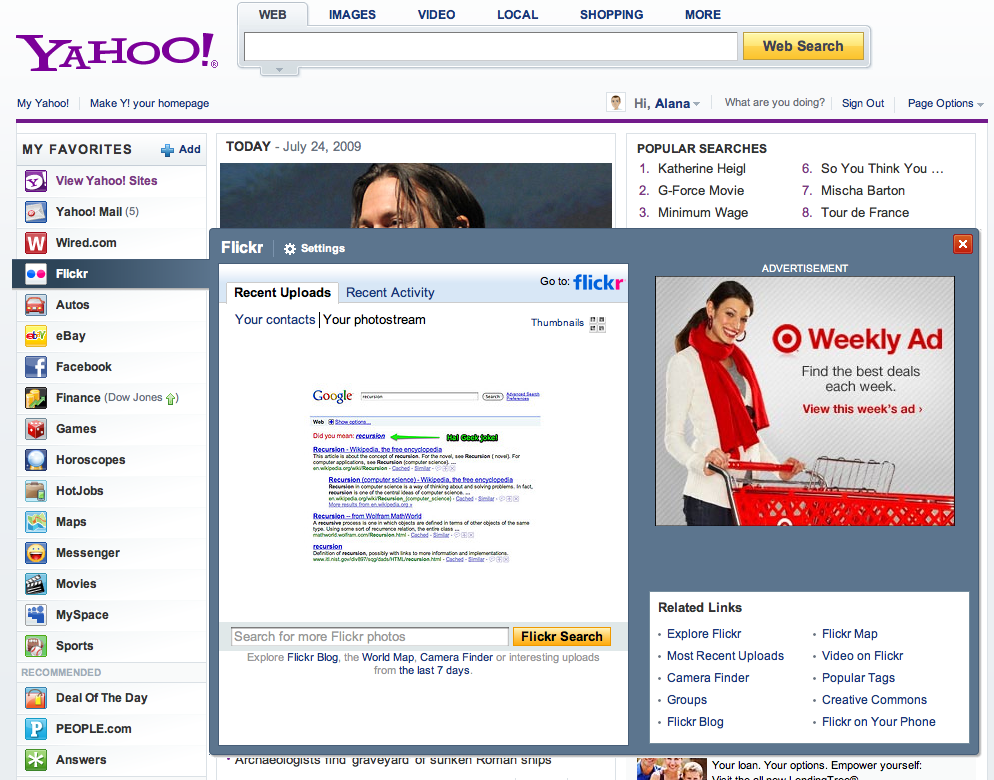
The new page looks really nice, with clean lines and a nice, editable left-hand navigation bar that allows people to prioritize which applications they want to see. If you want your Flickr pictures close at hand, you can add it easily. I think that this simple change could make the Yahoo homepage a great starting point for lots of people.
That said, two things struck me quite negatively as I was using the new home page.
First, the flyouts that are displayed as you hover over the navigation options are huge. They take up the entire page and seem unnecessary. If you’re going to show that much content on a hover (which people don’t particularly like anyway), why not just take me directly to the content in its native context? I would rather just go to Flickr than to see some condensed, compromised view which only seems to exist in order to show me an ad. Interestingly, maps and games didn’t have flyouts, and worked as you would expect. My guess is that these flyouts won’t last long…the fact that content appears on hover (vs. a concrete action) means that they will be loaded lots of times even if the user doesn’t want them to…and at Yahoo’s scale that’s a lot of extra bandwidth/processing/etc.
Second, and perhaps more critical, is the overall experience of the new homepage redesign. I really like the direction they are going, and once they get rid of the flyouts and refine the me-first dashboard experience of the homepage, I think it could be really valuable. But the moment you step off their brand new stage, your clean, vacuum-packed experience gets replaced with some other experience, the one on the other sites. For sites outside of the Yahoo domain, such as Facebook and Wired, this is inevitable. Even for Flickr, which is owned by Yahoo but has kept its own identity, you might expect that. But other sites within Yahoo are so disjointed that it feels like going from a beautiful atrium of a hotel to a dingy side enclave. You can almost feel yourself going back in time. This happens for autos, finance, games, horoscopes, maps, hotjobs, movies, sports. It doesn’t feel like a cohesive experience: it feels like a one-page experience. As a result, it’s easy to assume that all Yahoo’s attention is being paid to the home page while none of it is being paid to their other services.
What are your thoughts? Do you like the new Yahoo homepage?