Your Interface is Your Product
In Web 2.0, your interface is your product. It is not something bolted on, added later, or done as an afterthought. Increasingly, it is a key differentiator that people will use to evaluate and decide whether or not to continue coming back for what you have to offer. It is the frontier of design innovation. […]
In Web 2.0, your interface is your product. It is not something bolted on, added later, or done as an afterthought. Increasingly, it is a key differentiator that people will use to evaluate and decide whether or not to continue coming back for what you have to offer. It is the frontier of design innovation.
The way that this happened is a result of our finite attention span, our inability to learn about all of our many options, and our relatively simple needs as users. The more interfaces that exist that claim to do what we need them to do, the more the simple, approachable ones will win our attention because we simply don’t have time to compare all of the options thoroughly.
I was recently checking out backup software for my Powerbook and I was surprised at how many there were. I read about at least 10 of them, including this helpful article on MacZealots. In it, the author compares 6 backup programs on several criteria and ultimately chooses Synk because “it exceeded my expectations in terms of features, support, and simplicity”.
Notice that two of the three criteria aren’t functional. That’s because most of the applications all do the same thing, and since they’re mostly capable of handling it the criteria shifts away from functionality to something else: support and simplicity.
It’s the same on the Web, where we’ve got to the point where developers have licked the database, and building a database and the code to manage information in it is becoming not just doable, but commonplace. We’ve got people like Joshua Schacter creating Del.icio.us on his own, supporting tens of thousands of users, and doing it with aplomb. He’ll have scaling issues, to be sure, but he’s got the database access figured out.
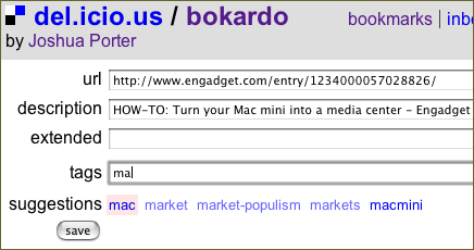
Schacter, like many developers out there, is focusing on his interface now. My favorite new interface feature is “Del.icio.us Suggest”, which shows you (while adding a tag) what tags you’ve created before and allows you to quickly insert them without having to type them in again.
Another example is Backpack. Backpack is one of the more interesting applications out there because it really doesn’t do all that much…and that’s the point. It allows you to create pages and include text, lists, images, or files and share them with others. It acts as repository for your information, with an easy-to-use interface that provides no hero-functionality, just good functionality that you don’t have to do yourself. Backpack is certainly something that others could build, and fast. The functionality would be easy to emulate, the interface hard.
This will continue to be the case in Web 2.0, which is all about public access to loads of information. The key word there is “public”. When developers can get their hands on another’s data via an API, their main task becomes not accessing the information but innovating the interface to that information. Because everyone else has the same access, the playing field is levelled on one axis, but opens up on another. The new axis of innovation: the interface.
The interesting thing about Del.icio.us and Backpack is that they both have APIs, and so are truly Web 2.0 applications. In other words, anybody with a little time on their hands would be able to create an alternative interface to each of these apps…and thus compete with them on some level for attention. But, given that these applications already have attention, combined with the fact that both are very easy to use, developers hoping to attempt an alternative interface would not only have to make it competitively easy, but actually build a better product.