Writing Microcopy
The fastest way to improve your interface is to improve your copy-writing.
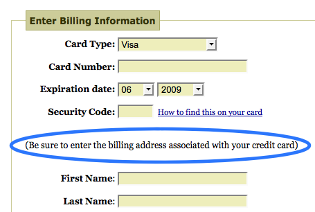
I remember the first time I realized how much even the smallest copy can matter in an interface. It was on an e-commerce project at UIE for which I had created a checkout form asking for billing information. I had coded up a system to notify me when an error occurred (even if people can overcome the error it was very helpful to know when one occurred). I kept getting notifications of billing address errors…it turns out that transactions were failing because the address people were entering didn’t match the one on their credit card.
So I ended up adding the copy “Be sure to enter the billing address associated with your credit card” at the top of the form. And just like that, the errors went away. It was clear the right copy meant I didn’t have to worry about that problem anymore, thus saving support time and increasing revenue on the improved conversion.
Ironically, the smallest bits of copy, microcopy, can have the biggest impact.
Microcopy is small yet powerful copy. It’s fast, light, and deadly. It’s a short sentence, a phrase, a few words. A single word. It’s the small copy that has the biggest impact. Don’t judge it on its size…judge it on its effectiveness.
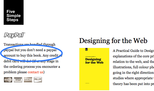
Here’s another example. On the purchase page of Mark Boulton’s wonderful book Designing for the Web, he’s written a bit of microcopy that is crucial for people considering purchase. The copy is “Transactions are handled through paypal but you don’t need a paypal account to buy this book“. This turns out to be a huge question of would-be purchasers (I’ve seen it in several projects). People see the Paypal logo and they assume that they need to have an account…and everyone knows how annoying it is to create an account simply to purchase a single item. Actually, for a long time you did need an account to purchase something with Paypal. Only more recently did they change that. In this example, Mark has written half a sentence that communicates this fact and eases the fears of would-be customers.
Update Reader David Yeiser points out another good example of microcopy on Tumblr. When users are about to sign up, they’re asked to choose a sub-domain name for their site. This seems like a big deal, as you’re defining the URL at which you’ll be found by others. In order to reduce the stress of making a big decision that could affect the future of your blog, Tumblr gently reminds you that “You can change this at any time”. Done. No more worries about choosing the wrong sub-domain name…just choose one and start posting.
Microcopy is extremely contextual…that’s why it’s so valuable. It answers a very specific question people have and speaks to their concerns right on the spot. And because its so contextual, microcopy isn’t always obvious. Sometimes you have to hunt to find the right words. (or create an error notification service like I did) How to discover these hurdles? Talk to people! Why aren’t they adopting your software? What concerns do they have? What are they worried about? Successful salesmen know the power of these small turns of phrase. They have an arsenal of them for every situation.
Here are some other examples:
- When signing up for a newsletter, say “this low-volume newsletter”
- When people add their emails, say “we hate spam as much as you do”
- When subscribing for something free, say “you can always unsubscribe at any time”
- When selling an paid-for web application, be sure to let people know if you have a free trial.
- When storing customer’s information, say “You can export your information at any time”
- If offering optional account creation, say “If you create an account, you’ll be able to track your package”
All of these microcopy examples have one thing in common: they help to alleviate concerns of would-be customers. They help to reduce commitment by speaking directly to the thoughts in people’s heads. That’s why this copy can be so short yet so powerful.
Don’t be deceived by the size of microcopy. It can make or break an interface.


