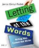
Book Recommendation: Letting Go of the Words
If there is one book you should read next, it’s “Letting Go of the Words” by Ginny Redish The other morning I changed my about section here on Bokardo to this: “Bokardo is a blog about interface design for social web sites and applications. I write about recommendation systems, identity, ratings, privacy, comments, profiles, tags, […]
If there is one book you should read next, it’s “Letting Go of the Words” by Ginny Redish
The other morning I changed my about section here on Bokardo to this:
“Bokardo is a blog about interface design for social web sites and applications. I write about recommendation systems, identity, ratings, privacy, comments, profiles, tags, reputation, sharing, as well as the social psychology underlying our motivation to use (or not use) these things. If this sounds interesting to you, grab my RSS Feed.”
This rewrite is an attempt to be as descriptive as possible. I need to explain exactly what I’m doing so that people who are new to the site know what they’re in for. I’m also giving people something to do with this information, asking them to grab my RSS feed if they find those topics interesting. If I can do this, then I’ve had a positive interaction with them.
Worrying about words might seem like a trifle, but from an interface design standpoint words are everything. If there is one thing I’ve learned as an interface designer, it’s that words are absolutely the most important part of interface design. If you don’t have the right words on the screen, you better hope you’re building a porn site.
To prove this, try to get rid of the words in your interface and see if people can use them. One thing you’ll find is how useless they are. This might lead us to believe that we need more useful graphics…and in general I think we do…but graphics can’t do the bulk of the work. Text must handle that job.
In her recent book Letting Go of the Words, Ginny Redish, who has been working on the web and building usable software as long as anyone, writes:
“People don’t come to the web to linger over the words. Most uses of the web are for gathering information or doing tasks, not for the pleasure of reading.”
This is exactly the mindset that most interface designers need. Now, there will certainly be exceptions to this, but the vast majority of people just need to know the basic facts.
- What is this?
- What good can it do me?
- How do I get that good to happen?
Other nuggets that Ginny talks about in depth:
- Write in the inverted pyramid style, leading with the main point
- Use bullets to help focus people on the steps you want them to perform
- Layer information, with periodic calls to action to grab people as they gain momentum
- Use questions in headers, which allows people to graze information and read what they need to
- Think about your writing from an information level, not a document level
The book the most solid reference I’ve seen on these topics. Don’t be dismayed at the book’s odd cover and somewhat disjointed page design…the content, as Ginny would tell you, is what you’re coming for.
I haven’t read the whole book yet, but the sections I have read lead me to believe that this book could be the most important web design book since Steve Krug’s Don’t Make Me Think.
In other words, I highly recommend Letting Go of the Words.
Previous
