Designing for the Social Web: Signs of Life
Given the choice between something that nobody has chosen to do and something that many people are doing, it is human nature to gravitate to what others are doing. Design accordingly.
It has long been known that savvy restaurants use a bag of tricks to build buzz and interest. One trick is to seat early customers near windows so that people passing by will think the place is full. This has the effect of making the place seem popular as people usually can’t see the empty seats that are further inside the restaurant.
A second trick restaurants use is to create a line out the door so that people think there is strong demand. This is also often artificial, making us think that many people are waiting to get in. Sometimes they merely create lines by not letting people sit down, making an excuse that the empty seats are “reserved”. Other times they simply don’t let people in. This is often practiced by nightclubs, who rely even more on mystique and exclusivity than restaurants do.
These techniques leverage powerful social behavior. When people are searching for a place to eat, they rely on the behavior of others to help them make their decision. They seek out signs of life…signs that other people are present and already doing something. If they are doing it, it must be worth it, we think. Given the choice between something that nobody has chosen to do and something that many people are doing, it is human nature to gravitate to what others are doing.
On the web, signs of life are extremely important, for several reasons.
- Too much choice
One reason is the sheer amount of choice we face. As the web continues its torrid growth, we simply have too many web sites to sort through, too many places to buy products from, too many software providers to pick from. - Black box of use
Another reason signs of life are important is that web applications are like black boxes. Many applications, like Google Docs, for example, require a login to use. Because of this we simply can’t see what others are doing with the software. We can’t see if they’re using it well or not using it at all.
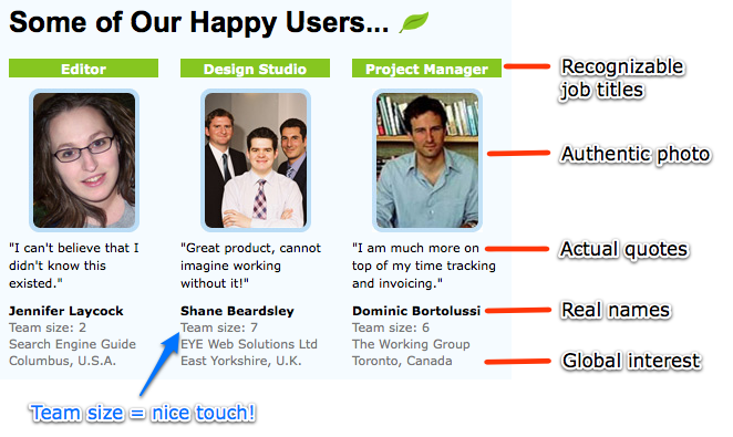
When sites leverage signs of life well, it provides welcome direction for folks trying to make a decision. A great example of signs of life is the Freshbooks home page, which contains an interface element called “Some of our happy users…”.
The happy users element does many things well. Most importantly, it is authentic. You immediately get the sense that these are real people who actually do like the product. The pictures are decent, but not airbrushed or overly produced. The quotes sound like real people, not infomercial-like. Subtle touches like using people from all over the world and including team size add to the sense that these people are just like you: the intended audience.
In addition to these testimonials, there are many other ways to leverage signs of life. I describe several more in Designing for the Social Web. But though leveraging signs of life in your design is powerful, it must be authentic. You can’t use stock photography and made-up quotes and expect people to react positively to them…people can smell fake a mile away.
While the Freshbooks people aren’t actually standing in line outside the door of a restaurant, they might as well be. They’re having the same effect: showing others there are people here using this software…acting as signs of life on what could otherwise be a desolate home page.
