In detail: Square’s email receipt and feedback flow
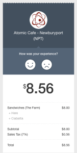
Since paper receipts aren’t very useful these days, I’ve been choosing recently to have my receipts emailed to me. The other week I filled out my email address on a Square checkout device at my local coffee house (Atomic Cafe) and didn’t think much of it. But when I read the email receipt later I noticed that the Square designers had very nicely embedded a feedback flow into the email.
Nice UI details:
- Feedback is embedded into the receipt. This has several positive effects. First, it ties the feedback to the actual transaction that the person just had and not some amorphous “experience with the company”. This will get you much better, detailed feedback because it focuses on a specific experience with the company. Second, it asks you at a time when you might be ready to give feedback, after you’ve had the experience. For experiences that take time (like enjoying a coffee or sandwich) there is no perfect time to ask. Attaching the question to the receipt seems like as good a time as any.
- The copy is friendly and efficient. How many surveys have you been solicited for that start out with something like “Would you like to take a survey? It would help us blah blah blah”. Most survey copy is not approachable and focuses on the hurdle of interrupting people for an answer. (it’s right that it is interruptive, but not helpful in copy). Instead, because this copy is in context, they skip right to the question: “How was your experience?”. It’s obvious that this is a survey! The smiley faces are approachable and obvious.
- The receipt looks like a receipt. Paper isn’t useful to have, but it makes sense to make this email look like a paper receipt to help communicate what it is just slightly more quickly. This takes advantage of our experiences with receipts. As paper receipts go away, one day this might not work.
- The company is primary, not Square. Square’s branding is very minimal here which reinforces my relationship with Atomic Cafe. I could easily see Square or a similar company mentioning themselves in order to build mindshare that they are the underlying technology. By keeping the focus on my relationship with Atomic Cafe the experience is better.
Problems with typical feedback surveys
Gathering feedback by embedding it into the receipt gets over a couple familiar problems with surveys. The most typical problem with surveys is that they are one-time mechanisms…they are typically sent as blast emails to a large group of people at a single point in time. They can gather extremely valuable feedback, but tend to have low response rates because they aren’t in context like in this receipt. And because they aren’t in context, it quickly gets annoying to send survey requests often…customers quickly tire of being asked. The data is also less useful in a typical survey because it’s usually generalized to your “overall experience” with the brand…not the experience of a specific transaction.
Typical survey feedback is also tied to where your product or experience is at the time of the survey. By tying the feedback mechanism with the receipt and making the feedback about this transaction, the data received with Square’s flow is more valuable than a generic survey because you know when the moment the experience happened (date/time of the receipt). Gathering ongoing feedback in this way is much more valuable than one-time surveys. You always have new feedback to respond to that is up-to-date.
Get better feedback by focusing on specifics
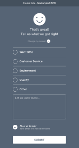
The subsequent screens of this flow are also nicely designed. When you give positive feedback (by clicking the happy face) you get a screen asking for more details about what you got right. This is great copy. Instead of saying “Give us more detail” or “Could you elaborate”, it asks for details about that specific experience. (in general asking for specifics is always more powerful than asking for generalities). The phrase “What did we get right?” frames the question nicely by focusing your attention on specific elements of the interaction that went right. Having answer categories also allows the business to get consistent feedback about specific topics that they want to know about and look for trends over time.
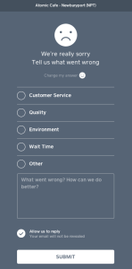
When you give negative feedback (by clicking the sad face) you get a very similar screen that asks for details in the same way. “Tell us what went wrong” is really nicely worded and acknowledges there was a problem. Again, the same copy technique is used to gather details about the transaction by focusing on specifics, not generalities.
Another nice detail
Another nice detail with the Square email flow: Once you enter your email address once, you’ll start getting email receipts from all the vendors you transact with who use Square. Since I gave my email address a couple weeks ago, I’m no longer asked if I want my receipt, Square automatically emails it to me and cashiers simply say “Ok, we just emailed you your receipt”. This saves everyone a little bit of time. Additionally, I found out that Square doesn’t share my email address with the vendor without my permission (even though each vendor now emails me my receipts). This is a nice privacy touch.
Because of all of these small details, Squares design here is really powerful, gathering specific feedback over time to companies who use the service. By focusing on gathering feedback in context the experience is easier for every party involved, and helps the business improve their product over time.


