The Value of Visualizing Information
Here’s a question: if you can’t illustrate an idea visually…is it really a clear idea?
I’ve been thinking lately that it might not be…that the ability to visualize is what makes an idea reality in a sense. I’ve heard many stories of how Einstein could visualize his theories (balloons and rubber tables, etc). There was also that amazing 60 Minutes segment on Daniel Tammet, the guy who saw every number as its own picture…he could memorize amazing amounts of things by simply seeing them as differentiated images in his mind.
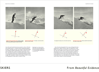
Maybe its because I finally saw Edward Tufte this past summer, whose work is quite misunderstood by a lot of folks. They say…what is he really adding to the design field? But to see his work is to understand that humans are visually conceptual beings, once we see something in a form that makes sense we’ve learned it, and can apply it as necessary. If you’ve never seen Tufte’s passion talking about Galileo’s notebooks then you must try to at some point. Tufte is an academic, to be sure, and his demeanor exposes the academic haughtiness for which he is often maligned. But to hear him talk about Galileo is to hear him as a student, in awe of a master.
Or maybe it’s because of all the social graph talk going on. What is a social graph? Well, show me why don’t you. The image I used the other day wasn’t very strong, a commenter immediately pointed out that I didn’t have bi-directional lines between the people. Besides meaning that I should have spent more than 5 minutes on the illustration, it’s actually a good sign that they pointed out I was wrong…it means that they’re on board with the visual, when they can find something wrong with it. In other words, they completely get the concept and get it so well that they recognize what’s wrong with it.
Here’s a question: if you can’t illustrate an idea visually…is it really a clear idea?
I’ve been thinking lately that it might not be…that the ability to visualize is what makes an idea reality in a sense. I’ve heard many stories of how Einstein could visualize his theories (balloons and rubber tables, etc). There was also that amazing 60 Minutes segment on Daniel Tammet, the guy who saw every number as its own picture…he could memorize amazing amounts of things by simply seeing them as differentiated images in his mind.
Maybe its because I finally saw Edward Tufte this past summer, whose work is quite misunderstood by a lot of folks. They say…what is he really adding to the design field? But to see his work is to understand that humans are visually conceptual beings, once we see something in a form that makes sense we’ve learned it, and can apply it as necessary. If you’ve never seen Tufte’s passion talking about Galileo’s notebooks then you must try to at some point. Tufte is an academic, to be sure, and his demeanor exposes the academic haughtiness for which he is often maligned. But to hear him talk about Galileo is to hear him as a student, in awe of a master.
Or maybe it’s because of all the social graph talk going on. What is a social graph? Well, show me why don’t you. The image I used the other day wasn’t very strong, a commenter immediately pointed out that I didn’t have bi-directional lines between the people. Besides meaning that I should have spent more than 5 minutes on the illustration, it’s actually a good sign that they pointed out I was wrong…it means that they’re on board with the visual, when they can find something wrong with it. In other words, they completely get the concept and get it so well that they recognize what’s wrong with it.
Information visualization as a business is also growing. I know of four companies, and I’m sure there are *many* more, that are doing awesome work basically making abstract concepts more clear by creating visualizations of them.
Lots of my work lately has been to show people images or sequences that represent ideas. I’m constantly advocating for a “How it works” section on web applications. Is it because the thing is complicated or there are too many steps to understand? No, not usually. Given enough time most folks can figure out anything. But as a rule we just don’t have time. What visuals do is take abstract thoughts (the words we use to describe the app) and make them concrete in a visualization…instantly.
Just like we can’t take a math class without drawing graphs, geometries, and areas under curves, so we can’t fully understand without seeing something visually. If not by an actual illustration by the creator of the idea, then by one we make up in our heads, on the spot.
Previous