January 6th, 2009
Thoughts on the Friendfeed interface
Note: Before I wrote this Paul Buchheit (of Friendfeed) had responded to others’ posts with a great post of his own Overnight success takes a long time and asked for feedback on the Friendfeed service. Consider this my contribution…
Some modest suggestions for improving the Friendfeed interface
Friendfeed is getting a lot of chatter in the blogosphere about what they should do with their service. I’m sure I don’t know the bigger issues that Friendfeed are dealing with, but I do have some observations about the interface, which I’ve summarized below.
But first, a little rationale about how I got to these suggestions. We must start with the simple question: What is the core mechanic of Friendfeed? What is the one thing that Friendfeed does that makes it a valuable service? I would argue that it’s reading the feeds of friends in order to discover valuable content.
The first thing you’ll notice when you set up an account, however, is that Friendfeed is a fire-hose of content. Like other streams, it produces way too much content to keep track of comprehensively. To that end, one of Friendfeed’s primary goals has to be the efficient management of the fire-hose. The service can do this in two ways: by providing powerful search and filtering features to reduce/organize the content one sees or by making the interaction with each piece of content more efficient.
Friendfeed seems to have a good handle on the first way, providing powerful search features and filters in the form of lists, rooms, ways to hide content, etc. I’m sure there are other good ways to push forward here, like a better notion of “quality” or recommendations or something similar. But the features Friendfeed has now are pretty good at letting people filter and organize content.
I think Friendfeed could focus more on the 2nd way of dealing with the fire-hose: make the interaction with each piece of content more efficient. The core problem with the Friendfeed interface, to that end, is that it is not easily scannable. By making the interface more easily scannable, the value of the entire application would increase.
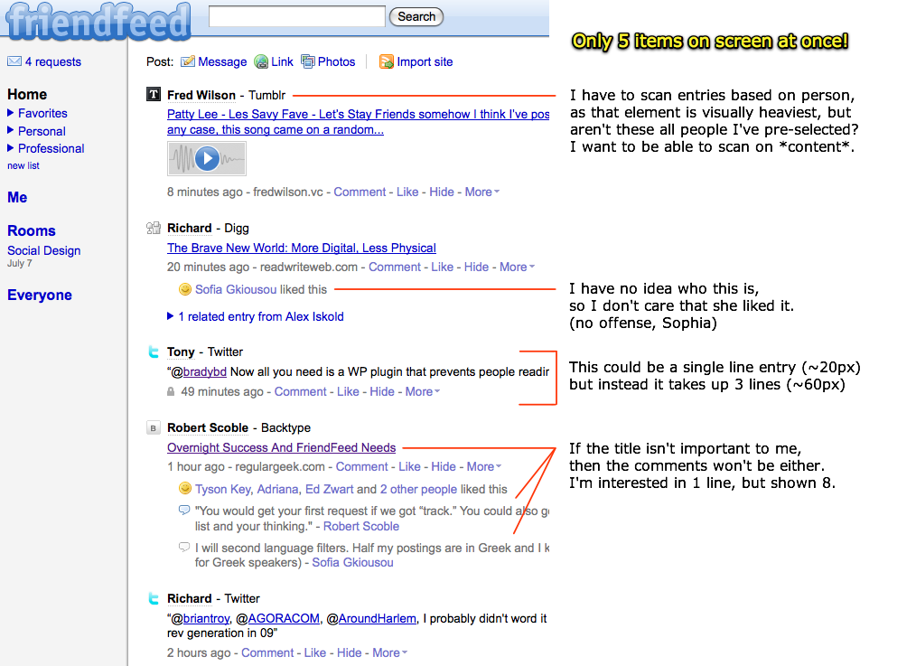
Here’s a screenshot I’ve annotated illustrating how Friendfeed might make their interface more scannable:
(click for full-size)
Too few items per screen
There are, on average, 4 to 5 items displayed per screen. This means that you can only see 5 items before you have to scroll down the page. It could be a lot more, like up near 15, if not 20 or more. Gmail, for example, which uses a mere 20 pixels of vertical screen height per item, can fit 25 items in the same amount of space. This allows for much faster scanning. (obviously the Friendfeed guys know this, as Paul designed Gmail, so I’m really curious about their design decision here)
Secondary information clogs up each item
The reason that there are too few items per screen is that Friendfeed uses a tremendous amount of vertical space to show items of secondary importance, including Likes, Comments, and the time the entry was posted. These items should be available, of course, but they needn’t take up so much room.
Now, it’s probable that Friendfeed keeps these comments inline because they are trying to bring conversation to the forefront. This makes sense. As you show more conversation, you get more conversation. But there are also ways to show there is a conversation without showing the actual comments…like for example displaying “5 comments” near an entry and allowing people to view the comments if they so choose.
Difficult to scan content titles quickly
As you can see from the screenshot, the element with the most visual weight in the Friendfeed interface are the names of people where the content originates. But is this the most important part of that content? I think that the title of the content is the most important part, and thus that should have the most visual weight, and thus be the most scannable. The person who submitted it is important, but secondary in my opinion, especially because these people are already in our good graces (we’ve subscribed to them).
People who aren’t my friends
By default, Friendfeed displays a whole bunch of content from people who are “friends of friends”. This content isn’t from people who you have chosen to receive content from, but from the people your friends have chosen to see content from. This is one of my long-standing frustrations with the interface. I have a hard enough time trying to make sense of the fire-hose of just my friends. Including more people that I don’t ask for is just too much.
So, in a word I think it’s all about scannability. I’m not suggesting that Friendfeed remove any of these features, but in the current design I just see too many distracting bits of information. Since Friendfeed opens up a veritable fire-hose of content, the interface needs to make the interaction with each bit of content as efficient as possible.

Links to this Post
Comments
1. Chris Thorpe 8:14am, Tue 6th, 2009
Really great piece Josh. Agree with all of the points. For me, the reason why I think FriendFeed has reduced scannability in comparison to sites like Twitter is that it’s much easier to scan a list of items with faces next to them to begin to see if it’s relevant. Obviously the usual UI cues of having items of font size and weight proportional to importance helps as well.
Evolution has given us highly developed facial recognition and for me a lot of what makes me interested in particular items within an activity stream is as much the who compared to the what or the where of an activity. The who has extreme relevance. Even though some people change their icon, or use a non-facial icon, I can still use that icon as a visual clue as to whether that item is worth further investigation (especially when busy).
2. Josh 8:35am, Tue 6th, 2009
@Chris – excellent point about the faces (avatars). That would help out a lot, too.
I should have pointed out that it’s not impossible to have a couple different ways to scan in the same interface…avatars alongside visually-weighted titles would allow people to choose their scanning type…in the same interface.
3. Tom Ribbens 8:50am, Tue 6th, 2009
You can choose to hide all the Friend of entries. Just hide one entry, click on “hide other items like this one”, and select the appropriate option.
4. Jon Heller 10:10am, Tue 6th, 2009
I absolutely agree, especially with what you mentioned about showing random people’s comments on items.
I see Friendfeed more as a “core” friend tool. I would use it to keep track of only my closest friends and family. I think your example of Scoble is great as he’s a prime example of information overload on Friendfeed.
5. Robert Scoble 10:22am, Tue 6th, 2009
Excellent points! I too wish I could toggle a view where all I see is titles in reverse-chronological order.
6. Patrick Pushor 10:30am, Tue 6th, 2009
Friends of friends represent huge potential value. I think getting rid of that mechanic would be a big mistake. Placing less emphasis on it than primary relationships makes sense.
7. Mathew Ballard 10:38am, Tue 6th, 2009
I guess I can see where your coming from, but I disagree with you. Personally I want to see the comments on the items while I’m scanning. Also, I wouldn’t want to see 10, 15, 20 items at a time on the screen as it would all be too distracting. With the current set up its pretty easy for me to scan the items in the feed and I tend to go through them pretty fast.
Also, what better way to discover new content then through people you don’t know. If you only see content from your friends then you are always going to be limited.
8. Cale 10:42am, Tue 6th, 2009
I love the amount of information FF provides, but I agree it needs to be better condensed. I’d like to see it shrunk down small enough to fit into a Twitterific type app but still show all this great content in proper context. I’m sure we’ll see good things coming soon.
9. Christopher G 11:19am, Tue 6th, 2009
Every suggestion is bunk — sorry, but taken one at a time:
Friend names *should* be the top item — this is *friend*feed. To demote that information… just think about it.
I do care who likes what — I get to know people that way. I seriously do — I have made real friends based on who likes what I like.
A single line entry would be Google Reader — thanks, I already have that option.
Finally, if a title doesn’t intrigue me, very often the comments do.
If I can be blunt: Scanability is *not* the fucking point. Social engagement is.
10. Jandy Stone 11:24am, Tue 6th, 2009
I see what you’re saying on most of your points; another thing that would help with comments is if the comments you’d already seen would condense, only showing the new ones since the last time you looked at the item. Not sure how to implement that, though, without having to manually interact with each item, and that would get annoying, too.
Friend of a Friend, though, is one of the most genius things about FriendFeed to me. It’s how I discover new people and new content, and it brings a TON of value to me. The good news is, you can turn it off, I can leave it on, everyone’s happy!
I agree with Scoble, the most useful thing for me would be to have an optional purely chronological view (not real-time) in addition to the active-items-on-top view. That would do more than anything to increase scanability, because I would know that I wouldn’t be seeing the same items over and over again.
11. Rolf Schewe 11:28am, Tue 6th, 2009
Filtering and search can be addressed by adding track-like functionality such as what Twitter originally used before it was shut down.
I agree on most of the points raised in this post.
The friends of friends posts as part of our feed kills the static page as well as real-time FriendFeed.
Too much data.
Most of the time I don’t know who the original author was for the thread these friends of friends are commenting on.
And the point on trimming down the size of the posts is very true. Put icons next to the posts like in the Real-time feed and reorganize the post layouts to take less real estate.
12. Ontario Emperor 11:30am, Tue 6th, 2009
I got here via Scoble’s share of your post in FriendFeed. While I personally don’t care for the suggestions you made, I evaluated them from the perspective of Louis Gray’s suggestion of a “Lite” version of FriendFeed for new users. From that perspective, your suggestions make perfect sense, since they don’t overwhelm the new user with a barrage of things. As time goes on, they can turn on things as they discover their benefits. (“Wow, you can see comments that people made on an item! I’m gonna turn that on now.”)
13. Josh 12:15pm, Tue 6th, 2009
@Ontario…well my suggestions may make sense from the standpoint of a lite version, I definitely do not think Friendfeed should ever think about actually making one…
14. Josh 12:27pm, Tue 6th, 2009
@Christopher G: While you make a very strong point (you can relax, we’re all friends here) I just don’t buy that the current interface is as efficient as it could be. I’m not arguing to get rid of those things, mind you, I’m just saying that they take up a lot of room in the current design.
15. Christopher G 3:05pm, Tue 6th, 2009
@Josh — right on, and I hope the strong points weren’t offensive. Just I’ve seen the scanability argument gain traction without people realizing what they give up in return, which is the very spirit of FriendFeed. You have to have the extra information of names and comments for a majority of the posts to get any attention at all. It has to all remain visible, without necessitating extra clicks. Smaller fonts and a wider content column could do enough to fix the inefficiencies. I’d like to see attempts at that first. Cheers!
16. Christopher G 3:29pm, Tue 6th, 2009
Maybe FF could allow people to Hide parts of the interface.
17. mikepk 3:40pm, Tue 6th, 2009
Hi Josh! don’t take the following too harshly, you know I like your work. The first iteration of Grazr’s homepage was still my favorite
.
I think you make some very strong points, and it’s a very good analysis, but I think your initial supposition is flawed. If FriendFeed’s purpose was the efficient discovery of new content, than I agree with you wholeheartedly. Unfortunately I think the problem here (and this is the same problem Grazr has struggled with and still faces) is discovering what its purpose really is.
FriendFeed is like Twitter in a lot of ways, that people are coming to it and having a fundamentally different experience of the service from each other. You, in effect, craft your own experience of it by how much you engage. It’s like the post Dave Winer had a while back about Twitter where he analogized it to the blind men and the elephant parable. Each had a different conception of what it fundamentally *was*. Twitter’s interface hasn’t changed much over time because, I would argue, they are cognizant of this point. Tweak it too much for a single purpose and you may disrupt the balance for others.
If you can answer that first, very important, question then it makes decisions about things like interface easier (not easy, but a lot easier). I’ve recently become a fan of FriendFeed, but I’ve been using it as a community. Often times the valuable content *is* the comments, from people like Derrick, Mona, and “Stupid Blogger Tina”. The conversations, finding new people, and seeing who likes what is a lot more important to my experience of it than just a scannable stream. I use Grazr as my scannable stream and frankly it’s much better suited to that kind of info consumption. Unfortunately I think the “river of news” scan is a more niche problem, one for “weirdos”, and I think FriendFeeds shooting for a more mainstream (or more social media savvy) audience. They may find one overriding purpose for the service / site, but I think they’re still in the exploratory phase of what it “wants to be”.
Just my $.02
18. Josh 4:29pm, Tue 6th, 2009
@mikepk: That, harsh? No way…you should see the stuff I delete.
I see your point, and I understand that many people use Friendfeed for social engagement around posts (especially after reading all the responses to this). But do people really read the comments on everything that comes through the reader? If they do, they must have some serious time on their hands…
I think the fundamental issue is that the system is architected to be a always-on fire-hose…there is so much information coming in that one cannot help but be overwhelmed by it. The inline comments and likes just seem to add to that fire-hose for me.
That said, perhaps FF is migrating toward the comments and things inline to differentiate itself…there certainly seems to be support for it from the FF community. And…it’s OK if I’m not part of that community…
19. Jodi Schneider 9:49pm, Tue 6th, 2009
To me, seeing content from friends of friends is one of the best things about friendfeed.
20. Alex Williams 2:18am, Wed 7th, 2009
I really don’t know/have never met most “friends” on FriendFeed, which causes frustration from the weight “friends” are given. I use FF for the variety of posted content/links, which is hard to scan. it’s annoying when the new comments or likes bumps something back up to the top. The message board vibe gets annoying sometimes as well.
21. Gregg H 2:50am, Wed 7th, 2009
I agree. When it comes to the UI, FF has done pretty much everything wrong.
22. StevenRay 2:54am, Wed 7th, 2009
The comments to the post are as interesting to me as the post. I’m suprised so many people find the FOF activity so valuable. It’s what I dislike about FF… I agree that a lot of this activity takes up too much space especially when it’s from so many people that you’re not “friends” with. I do however find value in the ability to scan the names because I can usually pick out people that submit content that I find more or less interesting. Just an extra filter when trying to save time. Thanks for the post!
23. Mathew Ballard 8:00am, Wed 7th, 2009
@Alex Then obviously Friendfeed is not for you then.
24. Phoebe 5:03am, Thu 8th, 2009
Interesting article and I agree with your basic emphasis on “scannability.” FF can’t be all things for all people, but as an aggregator it would be more useful with more personalization (even just on/off) options so people see what they want when scanning.
25. Sofia 12:50pm, Fri 9th, 2009
>> I have no idea who this is so I don’t care that she liked it. (No offence Sophia)
Don’t worry. None taken.
I like your ’scannability’ idea – even though I tend to like the chaos of friendfeed. Having said that I hate the chaos of twitter. Wouldn’t it be better if we could customise any service like that to suit our own preferences?
26. Alex Davidson 1:49am, Tue 27th, 2009
This is a great analysis of some of Friendfeed’s current UX problems. Since FF has recently added an import friends from twitter feature, the firehose has become even more powerful and thus the usability issues outlined here become even more critical for them to fix.