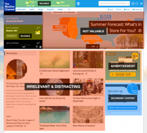
UI Analysis: Screen real estate on Weather.com homepage
One of my motivators for creating the What to Wear daily report was the poor experiences I have had with weather sites. I never seem to enjoy using weather sites to do even the simplest of tasks, like finding out what the weather is right now. It seems as though weather sites are not in the business of giving you a great weather report…and instead are in the business of selling advertisements.
Take, for example, Weather.com. It’s a perfect example of poor design resulting from intrusive advertising. To see how bad it is, just check out the real estate on the homepage. The vast majority of it is dedicated to content that has nothing at all to do with the weather! In fact, less than 10% of the screen real estate is displaying valuable information.
Note the following:
- The site recognizes me and knows that Boston and Newburyport are important to me. Why not just show me the forecast for those two places straightaway instead of having me click-through?
- Less than 10% of the real estate of this page is dedicated to the primary purpose most people have (to find out the weather). That’s the first litmus test of effective screen design…do the elements on the page support the primary use case? In this case they definitely don’t.
- The content on the site is silly content and meant for shock value. It might be content that people click on because it seems interesting, but it does nothing at all to further the interests of the users of the site. This is a short-term gain (in the form of pageviews) at the very real long term expense (providing real value). A losing formula.
The weather.com homepage is a great example of design gone wrong…over the years the website has put its advertiser’s needs above the needs of its users and is seeing lower engagement than if they provided easy, immediate access to weather reports. This becomes a vicious cycle…when engagement is down the focus becomes on spiking engagement, so they invest in secondary concerns like content and advertising that generates clicks but ultimately distracts from providing real value. Over time, things just get worse and worse until the site provides almost no real value at all.
