What it means when a client says “Pop”
I was in a meeting the other day when someone said “I think we need to make the logo bigger. It needs to pop”. I looked askance…pop?
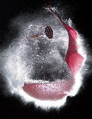
What on Earth does “pop” mean? Does it mean that you literally hear a noise when you look at it? Probably not. Does it mean that the logo actually animates a popping action when its loaded? Again, probably not. These two common meanings of the word, I daresay the most common, are not what the person meant.

Non-designers use lots of interesting words when talking about design. They say things like “make it pop”, “it looks sharp”, “it feels cluttered”, “the Web 2.0 look”. All of these things mean something to them, and it becomes the job of the designer to decipher that meaning and take actionable steps…
I was in a meeting the other day when someone said “I think we need to make the logo bigger. It needs to pop”. I looked askance…pop?
What on Earth does “pop” mean? Does it mean that you literally hear a noise when you look at it? Probably not. Does it mean that the logo actually animates a popping action when its loaded? Again, probably not. These two common meanings of the word, I daresay the most common, are not what the person meant.

Non-designers use lots of interesting words when talking about design. They say things like “make it pop”, “it looks sharp”, “it feels cluttered”, “the Web 2.0 look”. All of these things mean something to them, and it becomes the job of the designer to decipher that meaning and take actionable steps.
This problem isn’t limited to non-designers. Everybody has their own way of talking about design. Designers are just more used to translating between one person’s way of talking and another’s.
I’ve come to rely on two design terms that really help in these situations. One term is visual weight, which means how strongly something draws our eye toward it. If a design element is so bold and stands out so well that we can’t help but look at it, it has strong visual weight. In the case of “pop”, the person was asking for more visual weight, not a small explosion.
The second term is visual hierarchy. This means the order in which our eyes are drawn to objects on a page. In a solid design there is a clear visual hierarchy that focuses attention on the right elements and therefore the right message. In a weak design there is no clear hierarchy, so the message is potentially different for everyone and becomes weaker as a result.
If one is to use these terms with clients (as in my case), I have to use them consistently. Every time I use them I must ground what I’m saying to something they can immediately perceive in the design. Showing them good examples of a strong visual hierarchy is an easy way to do this. In many cases they begin to use the same terms after I’ve used them. Most people like using shared terms.
I try very hard to stay away from the teacher/student role. I hate the notion that the designer needs to “educate” the client. When these roles are demarcated it often happens that the teacher becomes the teacher in all parts of the relationship in an effort to satisfy and maintain the role. But, while I may be doing design work, I’m the student when it comes to learning about how they do business. I need to be a student of their strategy if I am to translate it into actionable design.
Instead, I like a partnership role. I may talk about design topics that they aren’t familiar with, and they might talk to me about how their business works. In many cases I discover really important information that I wouldn’t have found out about if I wasn’t in a partnership mode.
I’ve figured out by now that when people say “it feels cluttered” what they are really talking about is visual hierarchy. When they say “pop”, they are referring to visual weight. When they say “Web 2.0”, they are talking about designing with larger, sans-serif fonts, rounded corners, and bright colors: a relatively common style now. And when they say “sharp”, it means they find the design harmonious.
So the next time you hear someone say “make it pop”, don’t think of the loud sound of balloons popping, think of how you can translate that into concrete design terms and a shared vocabulary.