ARCHIVE: September, 2007

Open Letter to Derek Powazek

Dear Derek,

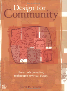
I’m writing to ask you if you would consider writing an update to your fantastic book Design for Community. Your book, as much as any other, helps to define what it means to create and curate community online. It’s a great book, but it’s a bit old and hard to find.

Design for Community

Web designers the world over, including myself, could really benefit from a 2nd edition. The world we’re designing for is all about community now, the social interactions of people in and around the things they’re passionate about. No longer are we a single person using a web site by ourselves. Now it’s all about multiple people participating, cooperating, and working together in countless ways. Community is a big part of that.

The copy of your book I had been using was at UIE, and since I’m not there everyday any more I don’t have easy access to it.

I tried to get myself a fresh copy of it the other day, and I couldn’t. On the publisher’s site (Peachpit Press) your book is simply not for sale. On Amazon it is unavailable new. Apparently, one of the best books on web design isn’t in print anymore!

Continue Reading: Open Letter to Derek Powazek
What it means when a client says “Pop”

I was in a meeting the other day when someone said “I think we need to make the logo bigger. It needs to pop”. I looked askance…pop?

What on Earth does “pop” mean? Does it mean that you literally hear a noise when you look at it? Probably not. Does it mean that the logo actually animates a popping action when its loaded? Again, probably not. These two common meanings of the word, I daresay the most common, are not what the person meant.

Balloon Popping

Non-designers use lots of interesting words when talking about design. They say things like “make it pop”, “it looks sharp”, “it feels cluttered”, “the Web 2.0 look”. All of these things mean something to them, and it becomes the job of the designer to decipher that meaning and take actionable steps…

Continue Reading: What it means when a client says “Pop”

On Increasingly Sophisticated Social Interfaces

In many circles you hear the call of software designers saying “Less is more”. In theory this is a good rallying call, getting designers to really think about each and every feature they add. But in practice it isn’t necessarily true that taking features out of a product, or not adding features to a product, makes it any better. Sometimes, more is more.

This is especially true in social interfaces that model complex social interactions. In some cases there is just no way around it: human relationships are complex and so whatever view we offer into them must have some complexity as well. That doesn’t mean they should be hard-to-use, it just means that they communicate sophisticated information.

Take the reviews on Amazon.com. For years Amazon’s interface showed the average review, so viewers could tell the general mood surrounding a book. If it was a 5 star or a 1 star book, then that would be instantly recognizable.

But over time it became clear that the rating system had a fault: if the average rating was somewhere in the middle, say 3.5 stars, it was unclear whether it was just a dull book that most people rated as mediocre or if it was a polarizing book that half the people rated 5 and half the people rated 1. A political book, for example, usually polarizes.

So the review interface could be made more sophisticated, showing more information about how the reviews for a particular book were distributed. Amazon came up with a nice interface for this…

Continue Reading: On Increasingly Sophisticated Social Interfaces

| Next Entries »