TAG: Social Design

Social Design Reading List

Just in time for the holidays, I’m releasing a much requested feature here at Bokardo:

Social Design Reading List

Over the past few months, lots of folks have asked me for a social design reading list. I started putting one together a while back, but it’s a lot more work than I originally anticipated. It’s hard to put together a decent list of books on a subject that doesn’t quite exist while also keeping that list to books you’re familiar with while also making sure those books are good.

As you browse the reading list, you’ll notice a few things. One is that almost all the books are soft-cover and relatively inexpensive ($10-$20). I tried to include easy-to-read books that you can take with you while traveling or actually hold up in bed. Second, you’ll notice there are only a few books on social theory and design. That’s because there just aren’t that many! I have included a lot of other web & interface design/development books I have found value in, so this isn’t exclusively a social design reading list. And, of course, people building social web applications have to do all the other parts of design as well.

If you do know of some books that should be added to the list, please let me know either in the comments or by contacting me. So far I’ve kept the list to books that I know and have read (at least parts of all of them). I’m sure there are others, but I didn’t want to include all books about social media, I only wanted to include the very best ones.

Why did I do this as an Amazon astore?

Continue Reading: Social Design Reading List

Canonical Web Design, Redux

I have rarely received as much feedback about a piece as I did for Do Canonical Web Designs Exist?

In that piece, I argued that Armin Vit’s Landmark Web Sites, Where Art Thou? was wrongheaded because he was judging web design from a graphic design standpoint. In my experience people aren’t very good judges of web design…and I’m including me, you, and anybody else. Only through actual use can we come to some conclusion about how good a design is. The act of using a web site changes meaning, passion, and value.

Here are some other, similar posts worth reading.

In Defense of Graphic Design on the Web – Christopher Fahey completely disagrees with me. He sees Armin as looking for landmark “graphic design on the web” and not landmark “web design”. If that’s the case, then as I say in the comments I’ll gladly bow out of the discussion and let the graphic designers tear up th carcass. But if Armin meant landmarks of “web design” (which I think he did), then I stick to my story…

I’m not a designer, but I play one on this blog – Jen Spadafora suggests that web sites really can’t be landmarks because they change so much. She points out that Amazon’s tabbed structure, certainly up there in terms of canonical web design, isn’t even there anymore. And, I would add, neither is Paul Rand’s UPS logo

Continue Reading: Canonical Web Design, Redux

Facebook’s Brilliant but Evil design

Seth Godin writes how 8 billion dollars worth of gift cards seeps through the cracks each year. Astounding number. He rightly points out the reason we buy so many gift cards: it is not socially acceptable to give cash as presents. But when we shift that cash into a gift card, we lose the risk of giving an unwanted gift while giving something more socially appropriate.

Such a small, yet large, difference.

In Chapter 4 of The Wealth of Networks, Yochai Benkler discusses a similar distinction between “extrinsic” motivations and “intrinsic” motivations. Extrinsic motivations come from the marketplace, and involve money. They are appropriate in some situations and not others. Intrinsic motivations come from within, such as pleasure or personal satisfaction. They are also appropriate in some situations and not others.

This distinction is important in social design because so many of the activities people participate in online are motivated from a desire of social standing, not economic standing.

Take the case of a New York Times article recommendation. If I send a link of a NYTimes article to you as a friend, my only motivation is social…intrinsic…and it’s probably a small one at that. I saw this article and I thought you might like it. My reward might be a small up-tick in your opinion of me.

But if I’m getting paid money to give you that recommendation, then my motivation is in part economic, and that changes everything. You are now suspicious of the gesture…and my reward might actually be a penalty…your opinion of me will most likely deteriorate.

When friends deal with friends, money often makes no sense.

Continue Reading: Facebook’s Brilliant but Evil design

Do Canonical Web Designs Exist?

Armin Vit at Speak Up asks: Where are the canonical web designs?

“Milton Glaser’s Dylan poster. Paul Rand’s IBM logo. Paula Scher’s Public Theater posters. Massimo Vignelli’s New York subway map. Kyle Cooper’s Seven opening titles. These are only a few landmark projects of our profession. Design solutions that, in their consistent use as exemplary cases of execution, concept and process, don’t even need to be shown anymore and that, for better or worse, (almost) everyone acknowledges as being seminal works that reflect the goals that graphic design strives for: A visual solution that not only enables, but also transcends, the message to become memorable in the eyes and minds of viewers. Whether these projects are indeed as amazing, relevant and enviable as we have built them up to be is cause for a separate discussion but it’s safe to say that, as far as designs recognized around the profession, there are a certain few that invariably make the list, usually without question. Myself, I could list projects in every category from logos, to annual reports, to magazine covers, to packaging, to typefaces, to opening titles that could be considered landmark projects… But when it comes to web sites, I can’t think of a single www that could be comparable — in gravitas, praise, or memorability — as any of the few projects I just mentioned. Could this be?”

Armin then goes and mentions the obvious answer: Google.

But this is not an acceptable answer for him, because…wait for it…the logo sucks.

To talk about Google in terms of its logo has long been a pastime for people who care about logos. For years I’ve heard the same argument from people who want nothing more than to get rid of the “Mickey Mouse” logo, as it is often described.

Armin’s point is that while Google seems to be better than Yahoo, it is still plagued with a bad logo. He’s not “moved or inspired” by the design. Therefore, he reasons, it is not canonical design. Canonical design, in his mind, is one that practitioners of the medium look to as exemplary.

But, frankly, I think Armin has missed his own point…

Continue Reading: Do Canonical Web Designs Exist?

Foamee: a barnacle app for indebted drinkers

Fellow North Shorer and superstah designer Dan Cederholm has released Foamee, a social web application that tracks who you owe beer to and who owes you a beer. Dan has a nice writeup on his motivation for building it.

foamee

Foamee is an interesting app, and not just because it involves drinking more. I find it fascinating because it is entirely reliant on the Twitter platform (at the moment, anyway). All messages in the Foamee system are Twitter messages.

For example, when you Twitter “@ioubeer @bokardo for allowing me to procrastinate by reading your blog” you are telling the Foamee system that you owe another Twitterer beer. Foamee keeps track of all of the IOUs so that at some point in the future you can make good on them.

In addition, all the information that Foamee knows about you comes from Twitter. Each Foameer? has what could be called a profile, but it is not editable and is made up entirely of information from Twitter: your handle and avatar as well as your IOU information that you’ve sent through Twitter. As Dan points out, this makes it nice and easy…no more profile information to add or import. Nothing to do! Nice.

When Dan was telling me about this app the word “barnacle” seemed to fit. So I think I’ll call this type of application a “barnacle app”. It attaches itself to Twitter and kind of filters through certain things it wants to keep. It can’t exist without Twitter, and in terms of getting up to speed that’s most definitely a benefit, not a liability.

So congrats to Dan on his latest creation: Foamee

Continue Reading: Foamee: a barnacle app for indebted drinkers

Ebay design: Provide Conditions to Cooperate

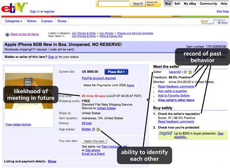
I gave a talk yesterday at User Interface 12 called “Theory and Practice of Social Design”. It’s an ever-evolving collection of social psychology theory and actual design practice. Here’s one of my favorite slides from the talk…I think it’s a good illustration of how we can use theory to inform our practice, and perhaps vice-versa.

In 1984 Robert Axelrod, who was doing studies on face-to-face groups at the time (no Web!), published a book called The Evolution of Cooperation. In it, he describes three conditions necessary for human cooperation.

  1. A likelihood of meeting in the future
    If people don’t think they’ll meet again in the future, there are no repercussions for not cooperating. Threats of not cooperating are of no use. People will act selfish if there is no future to the relationship. Therefore, the knowledge of future meetings changes our behavior because we feel some level of impending accountability for our actions.
  2. An ability to identify each other
    Identity is really important for cooperation because it allows us to know who we’re dealing with. If people can’t identify who they’re dealing with, then they can’t hold that person accountable. This doesn’t mean that we have to know everything about the person, like their address and where they live, it means that they are identified as a person to the system they’re in and the people they’re dealing with.
  3. A record of past behavior
    We have learned to assume that the best way to judge future behavior is by looking at past behavior. Thus having a positive record of behavior leads to cooperation. eBay’s seller ratings are a great example of this in action. Sellers accumulate status over time as they do business on the site. Sellers who have a rich transaction history with a high percentage of positive transactions are much more likely to be successful than those with no history.

Here’s a screenshot from eBay showing the presence of the three conditions.

3 Conditions to Cooperate
Click for full-size version

Continue Reading: Ebay design: Provide Conditions to Cooperate

The Difference between a Recommendation and an Ad

A quick thought regarding Facebook’s new Social Ads platform.

A recommendation is something you get from someone who knows something about you. They have seen an item of interest and thought that you might gain some use by it. They give their recommendation freely, knowing that it may do you some good, expecting nothing in return other than perhaps a “thank you”. Recommendations are thus social capital.

The primary reason for a recommendation is a need on the receiver’s side.

An advertisement is something you get from someone who may or may not know something about you. They have an item they want you to be interested in, and hope you might gain some use by it. They give it freely, but they do expect something in return as they are paying for this transaction. Thus they are biased, however small, to give you that ad. Advertisers will never give you what they objectively think is best for you. They’ll give you what they have. Ads are thus economic capital.

The primary reason for an advertisement is a need on the sender’s side.

Facebook cannot give recommendations as long as they accept money from advertisers which constrains the items available for placement. They are being paid to show only certain stuff…not necessarily the stuff that’s best for you, but the stuff made by the people who are giving them money.

To their credit, Facebook doesn’t seem to be using the term “recommendation”…yet.

Continue Reading: The Difference between a Recommendation and an Ad

Will Flickr and YouTube outlast MySpace and Facebook?

Fred Stutzman on a crucial difference between ego and object-centric social networks:

“A great photo-hosting service like Flickr (object-centric social network) stands alone without the network, making it less susceptible to (network) migration. An ego-centric network, on the other hand, has limited core-value – it’s value is largely in the network – making it highly susceptible to migration. We see this with Myspace: individuals lose little in terms of affordances when they migrate from Myspace to Facebook, making the main chore of migration network-reestablishment, a chore made ever-simpler as the migration cascade continues.

Of course, the problem with ego-centric networks lies in the fact network-reestablishment is the main chore. Talk to individuals joining Facebook today – what are they doing? They’re using inbox importers and searching to find their friends/ex-classmates/etc. It’s a game, it’s fun for a bit, but then (say it with me readers) “What’s next?” Yes, the what’s next moment occurs. This is not to say the network becomes useless: no, it’s very useful rolodex, and the newsfeeds introduce concepts of peripheral participation (or social surveillance), but the game is in essence over.”

Fred has a lot wrapped up in here. First, the cleavage on the lines of ego vs. object. Social networking sites are ego-centric. Object-centric social sites, like Flickr, YouTube, Del.icio.us, place something else at the nodes of the network (admittedly, though, Flickr is a tough one). I have previously called this the primary pivot. The way to ascertain what type of network you’re looking at is to look at what gets the URLs…what is the primary thing being shown at the URL? In ego-centric sites it’s a profile. In object-centric sites it’s the object…

Continue Reading: Will Flickr and YouTube outlast MySpace and Facebook?

Google’s Social Design Best Practices

Tucked away as part of the new Open Social initiative launched last week, Google engineers offered an interesting best practices document of social design dos and don’ts.

Social Design Best Practices

The list of best practices are as follows:

  1. Engage Quickly – (my interpretation: provide value within 30 seconds)
  2. Mimic Look and Feel – (make your widget look like the page it is in)
  3. Enable Self Expression – (let people personalize their widgets)
  4. Make it Dynamic – (keep showing new stuff)
  5. Expose Friend Activity – (show what friends are doing)
  6. Browse the Graph – (let people explore their friends and friends of friends)
  7. Drive Communication – (provide commenting features)
  8. Build Communities – (expose different axes of similarity)
  9. Solve Real World Tasks – (leverage people’s social connections to solve real problems)

This list is interesting for several reasons…

Continue Reading: Google’s Social Design Best Practices

Making private identity public

Chris Anderson, editor in chief at Wired, has published a list of 329 email addresses that have been used to send him PR SPAM in the last month. He says he’s fed up:

“I’ve had it. I get more than 300 emails a day and my problem isn’t spam, it’s PR people. Lazy flacks send press releases to the Editor in Chief of Wired because they can’t be bothered to find out who on my staff, if anyone, might actually be interested in what they’re pitching.”

Being someone who gets a small amount of PR SPAM (~10 a day), I certainly sympathize with Anderson’s move here. It’s tiresome to spend valuable time weeding through emails that at first seem addressed to you, until you realize they’re simply sent to a huge list of bloggers. They’re not personal messages. They’re generic. Some PR folks even lie and say “I’ve been reading your blog and I love everything you write, your child is beautiful, and may your family receive honor forever…etc…etc”. But after that it quickly becomes clear that they never refer to my blog specifically and they never tell me anything related to the topics I write about. It’s not informing. It’s insulting.

Here’s an example of one I got the other day. It’s not nearly as bad as some, but just as useless. It starts out…

Continue Reading: Making private identity public

« Previous Entries | Next Entries »