September 18th
Interface design is copywriting
Kind of impossible to separate the skills of interface design and copywriting.
Continue Reading: Interface design is copywriting
TAG: Interface Design
September 18th
Kind of impossible to separate the skills of interface design and copywriting.
Continue Reading: Interface design is copywriting
July 11th
The Google+ launch has been very positive for Google so far. I think it’s interesting from a UI standpoint for several reasons: 1. Andy Hertzfeld is lead Designer. This surprised a lot of people. Andy Hertzfeld is one of the original Apple Macintosh team members and is the lead designer of Google+, focusing on the […]
Continue Reading: 5 Reasons why Google+ is interesting UI.
June 9th
The fastest way to improve your interface is to improve your copy-writing.
Continue Reading: Writing Microcopy
March 26th
If interaction design isn’t about supporting and influencing behavior…then what exactly are you doing?
Continue Reading: Demystifying Interaction Design
September 20th
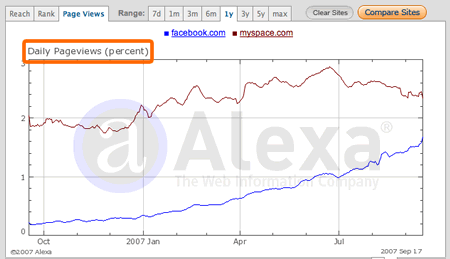
An interesting quote from Facebook’s founder Mark Zuckerberg, when asked if Facebook’s news feed feature, which aggregates disparate profile information into a single view, reduces page views (and presumably advertising revenue).
“our thinking is that if we give people more controls, they can share more information. As people shared more and more information, Facebook found that it creates a more component experience that brings them back to Facebook more often. Page views and traffic went up 50% within weeks of the launch of the news feed.”
Wow, that stat is amazing. A simple interface design feature, thought (by traditional thinking) to decrease page views, actually increased them and fast.

Zuckerberg’s response underlines a real distinction between the old page view approach to the Web and the new user experience approach. The difference lies in what you optimize for…
Continue Reading: Should designers optimize for page views…or user experience?
September 4th
In many circles you hear the call of software designers saying “Less is more”. In theory this is a good rallying call, getting designers to really think about each and every feature they add. But in practice it isn’t necessarily true that taking features out of a product, or not adding features to a product, makes it any better. Sometimes, more is more.
This is especially true in social interfaces that model complex social interactions. In some cases there is just no way around it: human relationships are complex and so whatever view we offer into them must have some complexity as well. That doesn’t mean they should be hard-to-use, it just means that they communicate sophisticated information.
Take the reviews on Amazon.com. For years Amazon’s interface showed the average review, so viewers could tell the general mood surrounding a book. If it was a 5 star or a 1 star book, then that would be instantly recognizable.
But over time it became clear that the rating system had a fault: if the average rating was somewhere in the middle, say 3.5 stars, it was unclear whether it was just a dull book that most people rated as mediocre or if it was a polarizing book that half the people rated 5 and half the people rated 1. A political book, for example, usually polarizes.
So the review interface could be made more sophisticated, showing more information about how the reviews for a particular book were distributed. Amazon came up with a nice interface for this…
Continue Reading: On Increasingly Sophisticated Social Interfaces
August 22nd
It’s not everyday that you get to redesign one of your favorites sites, so I’m very happy to announce that Bokardo Design’s first release is the redesign of Publishing 2.0. I’ve long been a reader of Scott Karp’s blog about the massive changes in publishing, advertising, and social media. It’s one of the blogs that kind of sits at the fringe of what I do, not directly about design but surely about the topics that are important to designers of new media. Scott’s handle on the big picture of forces in and around publishing have been incredibly insightful for me over the past year as newspapers have come under immense pressure from blogs and other disruptive media.
(We actually released it live last week, but I was away giving a talk on Social Design at UXWeek and couldn’t squeeze in the time to write it up until now)
Publishing2 was a great project for Bokardo Design because it dealt with a load of social features (being a blog and all). This was both a blessing and a curse, as getting the social features into the site was fun but also difficult because of dealing with so many Wordpress plugins working at once. We tried hard to get lots of useful features without cluttering up the interface. We consciously fought feature creep and tried to keep the site as personally valuable as possible. One way we did this was to use a plugin that allows folks to follow the comment stream of a blog post whether or not they actually comment on it themselves. Scott’s audience tends to comment in-depth, and they often provide serious insight in the comments. (I hope to add this feature to Bokardo in the near future)
Continue Reading: Announcing the Publishing 2.0 Redesign
August 9th
While I’m hurriedly working on building out a corporate site for Bokardo Design, I thought I would take a minute and share a little background which led me to starting the company and what services I’m offering.
Many of you know that I worked at User Interface Engineering for 5 years. It was definitely the best and most exciting job I’ve ever had; Jared and the team are fantastic. While I am super excited about what I’m doing now, I am sorry to leave such a unique and wonderful place. Even so, I won’t be leaving UIE completely…we’re still collaborating on several projects and will continue to do so where appropriate.

When I was at UIE I did a mix of usability consulting and web design. Usability consulting for UIE clients and in-house web design and development for UIE itself. So I basically alternated between consulting and designing. In hindsight this afforded me an excellent opportunity to understand the design problem from both sides of the fence: from the view of an objective 3rd party consultant as well as from the standpoint of an in-the-trenches designer. These worlds are incredibly different, and both are unique in their own way.
Continue Reading: Why I started Bokardo Design
August 7th
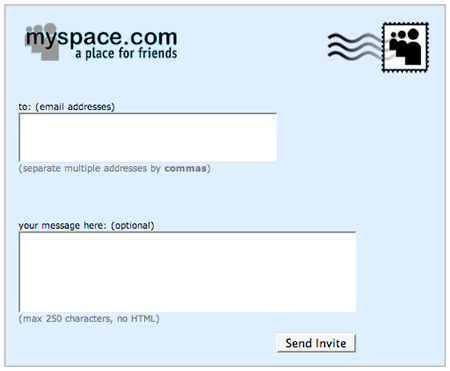
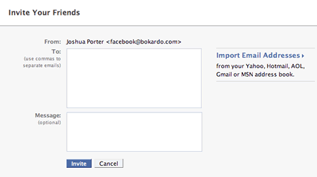
I’m introducing a new type of post here at Bokardo called “Interface Compare”. I’ll use it to compare interfaces from different services to highlight interesting things designers are doing (or not doing). The first installment is comparing the Invite screens on MySpace and Facebook.

The interface for this is pretty straightforward. You can type in the email addresses of all the friends who you would like to invite, separated by a comma. You can also add a message to the invite if you want.

You’ll notice one big difference between the Facebook and MySpace invite screens. Facebook allows you to import addresses from various third party email systems. You can grab your contacts from webmail services such as Gmail, Yahoo Mail, and Hotmail. You can also import contacts from your desktop mail applications as well.
Continue Reading: Interface Compare: Inviting Friends on MySpace & Facebook
August 1st
Luke Wroblewski shares a discussion on the ambiguous role of the designer:
Client: “Performance metrics, market landscape, product strategy? You don’t sound much like a designer. Shouldn’t we be discussing color options and page templates?”
Designer: “Design is the physical, or in this case digital, manifestation of your product strategy. Of course we could define your customers’ experience with ‘paint by number’. But I think you’d agree we should figure out what you want to say to your customers and why before we dive into how we’re going to say it.”
There are two ways to view Design here.
If you view it as creating interfaces to content, then you might stop short of talking about strategy. Instead, you would focus on how to display what you’ve got. Typography, grids, information hierarchy, big buttons, huge fonts, navigation bars, etc.
The other view that Luke alludes to is one that I believe we are moving toward, necessarily: having the designers in the strategy discussion alongside the “business strategy” people talking about the “what” as well as the “how”. (btw: this is the “strategy” part of the Bokardo Design: Interface design & strategy for social web applications). I would be doing both myself and my clients a disservice if I ignored how their business strategy can drive the design. A designer has done their job well when they have created an honest implementation of that business strategy.
Continue Reading: How does Strategy affect Design?