TAG: Social Design

The #1 Problem in Web Design

The world of web design is actually a gigantic game of telephone.

There are two messages involved in every web design project. One is the desired message, the message that the site owners want to deliver to their audience. This message probably has something to do with the value of participating, of using that tool or service to make your life better in some way.

The other is the actual message, the one that actually gets delivered. This message is usually some form of the desired message, but often has a lot of ambiguity and uncertainty thrown in. In the worst cases it is actually not the desired message at all but an unintended communication that means something completely different.

The number one problem on the Web today is a mismatch between the desired message and the actual message being delivered.

Remember the game of telephone, the one where you sit in a circle and whisper a message to the person beside you? That person then tells the person beside them, and once you get all the way around the circle you compare messages. Rarely are the messages the same. In many cases it is funny what we end up with. After all, it’s just a game.

But on the Web it isn’t so innocent…

Continue Reading: The #1 Problem in Web Design
Should designers optimize for page views…or user experience?

An interesting quote from Facebook’s founder Mark Zuckerberg, when asked if Facebook’s news feed feature, which aggregates disparate profile information into a single view, reduces page views (and presumably advertising revenue).

“our thinking is that if we give people more controls, they can share more information. As people shared more and more information, Facebook found that it creates a more component experience that brings them back to Facebook more often. Page views and traffic went up 50% within weeks of the launch of the news feed.”

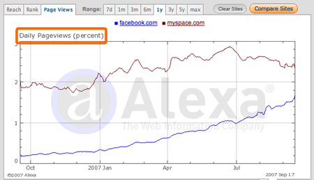
Wow, that stat is amazing. A simple interface design feature, thought (by traditional thinking) to decrease page views, actually increased them and fast.

Facebook vs. MySpace pageviews

Page Views vs. User Experience

Zuckerberg’s response underlines a real distinction between the old page view approach to the Web and the new user experience approach. The difference lies in what you optimize for…

Continue Reading: Should designers optimize for page views…or user experience?

Community Building isn’t about Features

This list of ways to build community features is interesting as much for what it leaves out as for what it leaves in

So two weeks after I called out Derek Powazek to write a 2nd edition of his book Designing for Community, his wife Heather Champ has put together a nice list of ways to build community, Flickr-style. (via Derek himself)

Businessweek: Ten Ways Flickr Builds Communities

Here’s the list…

  1. Engage
    Don’t just listen to your community. Engage
  2. Enforce
    Let the community help set standards and policies for appropriate behavior-then enforce them
  3. Take Responsibility
    Fess up immediately when you make mistakes
  4. ….

    Continue Reading: Community Building isn’t about Features

    Interesting Social Feature: The Yelp Elite Squad

    What’s the most interesting way you’re promoting your web site or application? Have you considered throwing a real-life party for it?

    That’s what Yelp.com is doing. A San Francisco-based review site, Yelp has been throwing parties for users of the site they call the “Yelp Elite” in various cities across the country in order to build up buzz.

    Yelp

    At first, these parties seem a bit silly (see the Yelp Blog for post-party details). Hosting a party around a site on which you read reviews? Doesn’t sound too exciting. It’s certainly not as compelling as the eBay Live! event, which is put on for people who use the auction site. Those people are definitely motivated to attend, eBay is how they make a living.

    But looking more closely at Yelp’s parties we can see a tactical reason why they might be doing this: they need to as a result of the nature of their site.

    Continue Reading: Interesting Social Feature: The Yelp Elite Squad

    How to be an Empathic Web Designer

    “A common mistake that people make when trying to design something completely foolproof is to underestimate the ingenuity of complete fools.” – Douglas Adams

    Part of being a web designer is trying to understand and make sense of how people are using your design. Therefore, being empathic, or having the ability to share and understand the feelings of another, is a valuable trait to have. The more empathic you are, the more you can understand how people are using your design, how they think and feel about it, and what you need to do to make it great.

    But how do you become empathic? What if you’re not naturally an empathic person? Here are a few things I try to keep in mind when I feel like I’m getting too far away from the people I design for.

    Keep an open mind

    It is a great irony that the people who claim to have open minds probably have closed ones, and the people who fear most a closed mind probably have the most open ones. But fear in this case is an enabler, as it allows the designer to keep up their energy and watchfulness for something new, something they didn’t understand before, something that is key to the success of their design. Once you have everything figured out, it’s time to stop designing.

    Continue Reading: How to be an Empathic Web Designer

    The Social Graph and Objects of Sociality

    Why our relationships can’t be explained without the objects and experiences that we share.

    One of the biggest problems on the Web is joining a new social networking site. To do so means going through the painful effort of creating a profile and adding all of our friends, something we’ve done over and over…at least once for each social networking site we already belong to. This is quickly becoming an issue for everyone who uses social networks.

    This problem has led to a flurry of activity, highlighted by LiveJournal creator Brad Fitzpatrick’s missive: Thoughts on the Social Graph, in which he clearly outlines the issues involved as well as some worthy goals to shoot for. Brad’s piece was followed shortly after by the Bill of Rights for Users of the Social Web, which among its rights is the right to allow users to syndicate their own profile and friend data. This, of course, would alleviate the squeaky wheel.

    Social Network

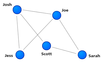
    In addition there are countless groups getting together to try and solve this problem. The microformats folks are working on building formats to help with this. The DataSharingSummit is an entire event focused on this and related problems. All of this activity is centered around one idea: that people have a social graph that can be represented in software. In other words, we can recreate our offline relationships online and let everyone know about it by sharing some sort of file or feed.

    The major axis of the social graph, as Fitzpatrick points out, is relationships between people, or more simply, a list of friends. My social graph, for example, consists of my friends, colleagues, family, and acquaintances. These people I know to some extent or another, some I talk with daily, some I know only online, and some I would rather not speak to. 🙂

    Continue Reading: The Social Graph and Objects of Sociality

    The Business of Design: Are our expectations changing?

    Businessweek’s Bruce Nussbaum, in a recent talk he gave at Innovation Night at the Royal College of Art in London. Definitely worth the read. (although I don’t buy his notion that CEOs need to be designers)

    “The second great trend that will soon have an impact on design is social networking. Social media is upending relationships between customers and corporations, brand owners and brand creators, consumers and producers, centralized authority and anarchistic periphery and—pay attention here—designers and their audiences. People want to design their own experiences, or at least have a big voice in it. With Web 2.0 technology and blogs, they get that voice. People are increasingly designing their own shoes and clothes, their own screen pages, their own interfaces, their own homes. And when they’re not, they want designers and managers to really understand what they have to say. Nike is changing the way it designs and manufactures because of social networking. So are dozens of other companies. Yes, we will always have our brilliant geniuses who intuit their audiences and create wonderful experiences for them. Ive and Jobs at Apple. Bang & Olufsen and its incredible designers and designs. But even Apple is getting hit very hard on the sustainability issue because it isn’t listening to its social networks. Brands have ideologies. They stand for things. People believe in those things. When the culture of Apples’ customers changes, as it is happening today, it has to move with it. You, as designers, can’t just do ethnology anymore. You have to join with those you’re observing to be in their culture and create with them.”

    Nussbaum sees the audience changing and demanding more because of the software they use and the culture of interaction they’re in. Their expectations are changing because of their experiences with social networking and the closer conversation between companies and customers. In short, Nussbaum sees the realization of the Cluetrain in social networking software.

    In addition, and perhaps more interestingly, Nussbaum suggests that companies mine their own social networks for signs of where their businesses should be trending. He doesn’t give any details of how that might happen, though…

    Continue Reading: The Business of Design: Are our expectations changing?

    The Danger of Aggregate Displays in Social Software

    Where is the ethical line drawn when designing interfaces that show popularity?

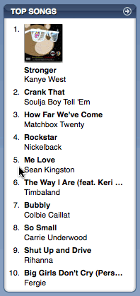
    One of the most important results of people interacting socially online is that we can measure the effect of social influence. A ground-breaking study by Columbia professor Duncan Watts showed how this could be done. (I wrote it up in How Aggregate Displays Change User Behavior) This is one of the most important studies I’ve seen…it clearly shows a relationship between people’s actions and the aggregate information that’s shown to them in the interface.

    iTunes Top Songs

    For those not familiar with Watts’ study, it showed that when faced with an interface showing what other people did we are definitely influenced by that behavior. If we are shown a list of the most downloaded songs, as in the study, we cannot help but give more weight to those songs downloaded more. We’ll be more likely to download those songs ourselves. This echoes countless studies from social psychology that show how we are affected by our environment.

    Dangerous Territory

    But one dangerous effect of aggregate displays might not be apparent at first. After we realize that our displays are affecting people, the next question becomes: which aggregate displays do we show and when? This is a question a lot of design teams are grappling with as they build out their social software.

    But taking it even further we get into ethical territory. This was made plain to me by a question that someone asked me the other day after we were discussing Watts’ study. They asked: “If people respond to aggregate displays, and change their behavior accordingly as they’ve done in Watts’ study, aren’t those people also in a position to be manipulated?”

    Continue Reading: The Danger of Aggregate Displays in Social Software

    Open Letter to Derek Powazek

    Dear Derek,

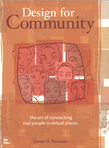
    I’m writing to ask you if you would consider writing an update to your fantastic book Design for Community. Your book, as much as any other, helps to define what it means to create and curate community online. It’s a great book, but it’s a bit old and hard to find.

    Design for Community

    Web designers the world over, including myself, could really benefit from a 2nd edition. The world we’re designing for is all about community now, the social interactions of people in and around the things they’re passionate about. No longer are we a single person using a web site by ourselves. Now it’s all about multiple people participating, cooperating, and working together in countless ways. Community is a big part of that.

    The copy of your book I had been using was at UIE, and since I’m not there everyday any more I don’t have easy access to it.

    I tried to get myself a fresh copy of it the other day, and I couldn’t. On the publisher’s site (Peachpit Press) your book is simply not for sale. On Amazon it is unavailable new. Apparently, one of the best books on web design isn’t in print anymore!

    Continue Reading: Open Letter to Derek Powazek

    What it means when a client says “Pop”

    I was in a meeting the other day when someone said “I think we need to make the logo bigger. It needs to pop”. I looked askance…pop?

    What on Earth does “pop” mean? Does it mean that you literally hear a noise when you look at it? Probably not. Does it mean that the logo actually animates a popping action when its loaded? Again, probably not. These two common meanings of the word, I daresay the most common, are not what the person meant.

    Balloon Popping

    Non-designers use lots of interesting words when talking about design. They say things like “make it pop”, “it looks sharp”, “it feels cluttered”, “the Web 2.0 look”. All of these things mean something to them, and it becomes the job of the designer to decipher that meaning and take actionable steps…

    Continue Reading: What it means when a client says “Pop”

    « Previous Entries | Next Entries »