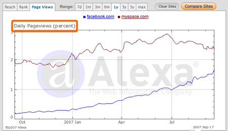
June 6th
Creating Engaged and Passionate Users, Part 2
Part 2 of an interview I did with Christine Perfetti on creating engaged and passionate users.
Continue Reading: Creating Engaged and Passionate Users, Part 2
TAG: MySpace
June 6th
Part 2 of an interview I did with Christine Perfetti on creating engaged and passionate users.
Continue Reading: Creating Engaged and Passionate Users, Part 2
February 10th
There’s been lots of talk recently about the ineffectiveness of advertisements in social media properties like MySpace and Facebook. During their recent quarterly earnings results, Google explained that they are not making as much money from ads on social network sites as they had predicted. Even though this was a blip on an otherwise stellar quarter, Google’s stock took a serious beating.
Why is this so? Why is it that Google monetizes so well on Search while having a hard time on social properties? Given an equal amount of views on Google vs. MySpace, shouldn’t they be able to get about the same number of click-throughs and thus ad revenue?
The difference, of course, is that when people go to Google, they’re actively looking for something. That something isn’t on Google. They are performing a search activity. Thus their task will be to click on a link that seems to promise what it is they’re looking for. It may be the organic results, or it may be an ad that seems close to what they want.
When people are on MySpace, the activity they’re doing isn’t search. It’s something akin to “hanging out” or “networking”. Their task is almost the opposite of search. They are already on the site they want to be on. They don’t need to click on links to take them where they want to go.
In other words, the context is entirely different. When you’re in search mode, you are playing by different rules.
Social ads don’t work as well because people are being social, not searching for something.
Continue Reading: Why Social Ads Don’t Work
November 14th
Armin Vit at Speak Up asks: Where are the canonical web designs?
“Milton Glaser’s Dylan poster. Paul Rand’s IBM logo. Paula Scher’s Public Theater posters. Massimo Vignelli’s New York subway map. Kyle Cooper’s Seven opening titles. These are only a few landmark projects of our profession. Design solutions that, in their consistent use as exemplary cases of execution, concept and process, don’t even need to be shown anymore and that, for better or worse, (almost) everyone acknowledges as being seminal works that reflect the goals that graphic design strives for: A visual solution that not only enables, but also transcends, the message to become memorable in the eyes and minds of viewers. Whether these projects are indeed as amazing, relevant and enviable as we have built them up to be is cause for a separate discussion but it’s safe to say that, as far as designs recognized around the profession, there are a certain few that invariably make the list, usually without question. Myself, I could list projects in every category from logos, to annual reports, to magazine covers, to packaging, to typefaces, to opening titles that could be considered landmark projects… But when it comes to web sites, I can’t think of a single www that could be comparable — in gravitas, praise, or memorability — as any of the few projects I just mentioned. Could this be?”
Armin then goes and mentions the obvious answer: Google.
But this is not an acceptable answer for him, because…wait for it…the logo sucks.
To talk about Google in terms of its logo has long been a pastime for people who care about logos. For years I’ve heard the same argument from people who want nothing more than to get rid of the “Mickey Mouse” logo, as it is often described.
Armin’s point is that while Google seems to be better than Yahoo, it is still plagued with a bad logo. He’s not “moved or inspired” by the design. Therefore, he reasons, it is not canonical design. Canonical design, in his mind, is one that practitioners of the medium look to as exemplary.
But, frankly, I think Armin has missed his own point…
Continue Reading: Do Canonical Web Designs Exist?
September 20th
An interesting quote from Facebook’s founder Mark Zuckerberg, when asked if Facebook’s news feed feature, which aggregates disparate profile information into a single view, reduces page views (and presumably advertising revenue).
“our thinking is that if we give people more controls, they can share more information. As people shared more and more information, Facebook found that it creates a more component experience that brings them back to Facebook more often. Page views and traffic went up 50% within weeks of the launch of the news feed.”
Wow, that stat is amazing. A simple interface design feature, thought (by traditional thinking) to decrease page views, actually increased them and fast.

Zuckerberg’s response underlines a real distinction between the old page view approach to the Web and the new user experience approach. The difference lies in what you optimize for…
Continue Reading: Should designers optimize for page views…or user experience?
August 7th
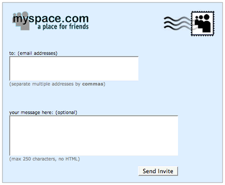
I’m introducing a new type of post here at Bokardo called “Interface Compare”. I’ll use it to compare interfaces from different services to highlight interesting things designers are doing (or not doing). The first installment is comparing the Invite screens on MySpace and Facebook.

The interface for this is pretty straightforward. You can type in the email addresses of all the friends who you would like to invite, separated by a comma. You can also add a message to the invite if you want.

You’ll notice one big difference between the Facebook and MySpace invite screens. Facebook allows you to import addresses from various third party email systems. You can grab your contacts from webmail services such as Gmail, Yahoo Mail, and Hotmail. You can also import contacts from your desktop mail applications as well.
Continue Reading: Interface Compare: Inviting Friends on MySpace & Facebook
June 25th
Danah Boyd, who routinely interviews folks who use MySpace and Facebook, says there is a class divide between the services, with Facebook garnering a higher socio-economic class than MySpace.
Viewing American class divisions through Facebook and MySpace
As Danah admits, it’s difficult talking about class. I’m always uncomfortable with it because it’s always a spectrum…there is no clear distinction between this class and that class. Even the “cool” kids class had some people who could cross into the “skater” kids class when I was in high school. Also, talking about class can only reinforce it. To that end I wonder what sorts of things we’re going to learn from this distinction…does talking about class make us any smarter, or simply make us more likely to make class distinctions? (to her credit: Danah makes it clear that she’s having a hard time discussing this).
One way that I think would be interesting to cut up the populations would be activity. Are the people using MySpace for different reasons than Facebook? Are the two services equivalent from a tool standpoint? What about people who use both? It seems that Danah is talking about them equivalently, although in this case that’s not the focus of her piece so I don’t know for sure.
Continue Reading: Social Classes on Networking Sites
May 8th
MySpace profile pic prevents woman from getting her teaching degree, showing how powerful online profiles are
 A story at CNN.com describes how 27 year-old Stacy Snyder was denied a teaching degree because she posted a photo of herself on her MySpace account that the school said “promoted underage drinking”.
The photo, which shows her drinking from a cup with a pirate’s hat on has the caption “drunken pirate” underneath. The picture was taken at a 2005 Halloween Party.
This story highlights several important points about profiles and pictures…
Continue Reading: Woman Denied Degree because of MySpace Profile Pic
April 20th
Why opinions from anybody but users rarely matter.
Continue Reading: The hidden lives of MySpacers
February 7th
How an over-focus on technology and visual design can hide the real value of social software.
In a fascinating piece on the amazing growth of the photo-sharing site Fotolog, Jason Kottke clearly articulates a growing problem in design:
“Fotolog…relative to Flickr…has changed little in the past couple of years. Fotolog has groups and message boards, but they’re not done as well as Flickr’s and there’s no tags, no APIs, no JavaScript widgets, no “embed this photo on your blog/MySpace”, and no helpful Ajax design elements, all supposedly required elements for a successful site in the Web 2.0 era. Even now, Fotolog’s feature set and design remains planted firmly in Web 1.0 territory.”
How do sites with sub-optimal visual design and technology grow so big and become so successful?
Continue Reading: How to Prevent Valueless Design in Social Web Sites