TAG: Social Design

Great Community Design Talk by Christina Wodtke

Update: Christina has a follow-up to this piece in which she suggests that Facebook is a lot like the next Google.

On Tuesday I had the good fortune to attend an excellent presentation on community design by Christina Wodtke at the DocTrain East Conference in Lowell, MA. Unfortunately, it was the only session I attended (lots of sessions looked good, like Steve Mulder’s talk on Personas), as I got sick Tuesday night and wasn’t able to return.

Here’s the embedded slide deck from Slideshare, but I would recommend downloading the Powerpoint slides as some of the text isn’t legible in the Flash conversion.

Christina’s talk was excellent, and I took a lot of notes. Here are the highlights that really stood out to me. (although, I must say that there was a lot more than I’ve written here)

Continue Reading: Great Community Design Talk by Christina Wodtke

Humility and Arrogance

Clay Shirky, who has made a name for himself by turning conventional wisdom on its head, has a provocative piece in this week’s A Brief Message:

“Arrogance without humility is a recipe for high-concept irrelevance; humility without arrogance guarantees unending mediocrity. Figuring out how to be arrogant and humble at once, figuring out when to watch users and when to ignore them for this particular problem, for these users, today, is the problem of the designer.”

Can a designer be arrogant and still have humility?

This question is particularly interesting for me. In 5 Principles to Design By, I advocated for humility, suggesting that the designer must get over themselves if they are to create a really great design. But now that I think about it, with Clay’s insistence, it might be possible to be arrogant at the same time. If Design is your muse, and you stop at nothing to create a great design, it might be considered arrogant. But are you putting your own values above others, or are you deferring to the Muse?

On that note, every time I watch an interview with the iPod’s designer, Jonathan Ive, I’m struck by his humility. Soft spoken, curious, and quietly confident. Yet we all know that the iPod would never have happened without Steve Jobs, considered by many to be extremely arrogant. Could that be it? Could arrogance and humility be the two sides of the design coin, embodied to near perfection by the Apple duo?

A Brief Message is a nicely done mini-blog site, consisting of 200 word posts and illustrations from designers and thinkers on interesting topics. A bite-sized portion for a YouTube world.

Continue Reading: Humility and Arrogance

Be Careful What you Put in a Template

Seth Godin says that people are going to hate his post How to create a good enough website. I don’t hate it, but I do have a word of caution for what Seth is advocating.

Continue Reading: Be Careful What you Put in a Template

Weak Ties and Diversity in Social Networks

Anne Truitt Zelenka has a nice post: Weak Ties for Social Problem Solving in Enterprise 2.0, touching on a subject being discussed more and more these days: weak ties. She suggests that one of the next challenges for social software is distributed problem solving: how to leverage your social network when you have a tough problem to solve.

One of pieces Anne references is Andrew McAfee’s The Ties that Find, a nice overview of the idea of weak ties, which originated with the fascinating work of Mark Granovetter, who wrote the original work The Strength of Weak Ties(PDF) in 1973. Weak ties are relationships we have with people outside our own social networks. We don’t utilize them often, but we utilize them in certain situations to help us with things our social networks can’t. Most importantly, weak ties gives us a perspective outside of the normal groups of which we are a part, whose perspectives tend to become homogenized over time as we learn and become familiar with the people we spend the most time with.

What struck me about Anne and Andrew’s pieces was the implicit idea of the value of diversity. Neither mentioned this explicitly, but for those familiar with James Surowiecki’s work The Wisdom of Crowds, diversity is crucial to wisdom, and thus problem solving. Weak ties helps explain how we continually introduce diversity within our social groups, by periodically leveraging those relationships with people outside our close-knit social networks.

Continue Reading: Weak Ties and Diversity in Social Networks

What Barnes & Noble could have said

Company CEO Marie Toulantis on Barnes & Noble’s new web site redesign: (via RWW)

“We wanted our site to have more motion, more content and more interactivity, and to have more of a sense of community”

Granted this is only a single sentence, but it happened to be the one they’re getting press with. And what a quote it is! It highlights the struggle that so many web sites out there have: to communicate why their site is better at doing what people actually need from it.

Barnes and Noble

So, what people end up asking themselves is: “does motion, content, and/or interactivity get me better books? Does it let me shop easier? Faster? Cheaper? Can I find more books on the topics I’m interested in?”

The answer is No…

Continue Reading: What Barnes & Noble could have said

Ballmer on Facebook: Bunch of Features

Microsoft’s Steve Ballmer: (via)

““There can’t be any more deep technology in Facebook than what dozens of people could write in a couple of years. That’s for sure,”

Robert Scoble, in Steve Ballmer still doesn’t understand social networking:

“When I worked at Microsoft I heard this over and over and over again from various engineers and program managers who STILL haven’t competed effectively with WordPress, Flickr, Skype, YouTube, or any of the other things over the years I’ve heard this “we can build that in a few weeks” kind of arrogant attitude attached to.”

Continue Reading: Ballmer on Facebook: Bunch of Features

Finding the primary pivot

Over time, the primary pivot of social software has shifted away from the topic thread and toward the person.

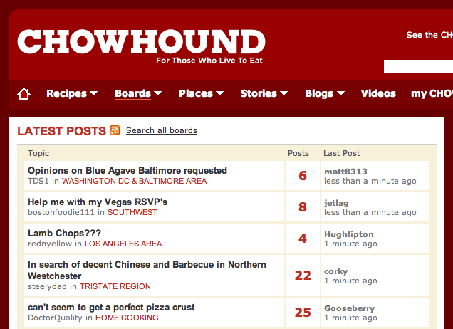
Chowhound.com is one of the most successful sites for foodies on the Web. When you visit the home page, you’re given a list of topics that any food lover, at first glance, would be happy to read. Here’s what was on the home page when I looked at it today.

Chowhound boards

As you can see, the primary mode of navigation on Chowhound, the primary pivot, is the discussion thread. The elements of the interface are all organized around the idea that the topic of discussion is the most important thing. Therefore, the features tend to be those that support it: comments, threaded comments, most active threads, topics.

Continue Reading: Finding the primary pivot

Jeff Bezos on Amazon’s Personalization Strategy

An oldie but goodie (from a 1998 interview)

“In the online world, businesses have the opportunity to develop very deep relationships with customers, both through accepting preferences of customers and then observing their purchase behavior over time, so that you can get that individualized knowledge of the customer and use that individualized knowledge of the customer to accelerate their discovery process.

If we can do that, then the customers are going to feel a deep loyalty to us, because we know them so well. And if they switch to a competitive website – as long as we never give them a reason to switch, as long as we’re not trying to charge higher prices or providing lousy service, or don’t have the selection that they require; as long as none of those things happen – they’re going to stick with us because they are going to be able to get a personalized service, a customized website that takes into account the years of relationship we’ve built with them.”

It is easy to see how Amazon’s business strategy is manifested in their design decisions…

Continue Reading: Jeff Bezos on Amazon’s Personalization Strategy

Improve your online sharing

A large part of social design is sharing. How do you encourage sharing? What should you let people share? Is there a way to improve the act of sharing? How do you know if sharing is successful?

Sharing is a pretty straight-forward process. Someone finds something interesting/controversial/useful enough to tell someone else about it. Breaking down this process into smaller steps can help you design better methods for sharing.

  1. Something worth sharing
    First, you need something worth sharing. It could be an object, like a video, slideshow, picture, or URL. Or it could be an idea or process, like a new way to cook spaghetti or a better way to design web sites. Ideas, however, need to be distilled into an object as well…since we’re on the Web most of the time the objects are URLs.
  2. Pivot points for sharing
    A good question to ask is: what are the pivot points on which this thing is shared? Here’s an example: most TV shows are shared not by the network they’re on, but by the title of the show. This suggests that network doesn’t matter as much as the show, and so giving people the tools to share the show is a higher priority. However, if you notice when you’re watching a TV show, there is a ton of network advertising…but nobody really shares at this level so it’s just not that effective…

Continue Reading: Improve your online sharing

The Value of Visualizing Information

Here’s a question: if you can’t illustrate an idea visually…is it really a clear idea?

I’ve been thinking lately that it might not be…that the ability to visualize is what makes an idea reality in a sense. I’ve heard many stories of how Einstein could visualize his theories (balloons and rubber tables, etc). There was also that amazing 60 Minutes segment on Daniel Tammet, the guy who saw every number as its own picture…he could memorize amazing amounts of things by simply seeing them as differentiated images in his mind.

Tufte's Skiers

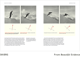
Maybe its because I finally saw Edward Tufte this past summer, whose work is quite misunderstood by a lot of folks. They say…what is he really adding to the design field? But to see his work is to understand that humans are visually conceptual beings, once we see something in a form that makes sense we’ve learned it, and can apply it as necessary. If you’ve never seen Tufte’s passion talking about Galileo’s notebooks then you must try to at some point. Tufte is an academic, to be sure, and his demeanor exposes the academic haughtiness for which he is often maligned. But to hear him talk about Galileo is to hear him as a student, in awe of a master.

Or maybe it’s because of all the social graph talk going on. What is a social graph? Well, show me why don’t you. The image I used the other day wasn’t very strong, a commenter immediately pointed out that I didn’t have bi-directional lines between the people. Besides meaning that I should have spent more than 5 minutes on the illustration, it’s actually a good sign that they pointed out I was wrong…it means that they’re on board with the visual, when they can find something wrong with it. In other words, they completely get the concept and get it so well that they recognize what’s wrong with it.

Continue Reading: The Value of Visualizing Information

« Previous Entries | Next Entries »